A neutral palette makes a beautiful base for interior design - but it needn’t mean strictly adhering to a scheme of one or two classic whites or creams. Looking to deeper, bolder neutrals that work tonally with your classics is a very simple way to add greater depth, visual interest and warmth to your rooms, while keeping to a versatile neutral look.
Resene’s range of triple-strength neutrals offers darker, stronger versions of some of the most popular neutrals, opening up a raft of possibilities when it comes to creating a complex layered look in your interiors that can add dimension to small spaces, or warmth to large open areas.
What are triple colours?
Start your property search
Simply put, Resene’s range of triple neutrals are darker copies of their single strength versions. They essentially have three times the pigment, resulting in richer, more saturated tones. “As a colour goes into the triple strength it gets darker because, as the name suggests, it’s the triple strength of the standard colour,” says Resene colour consultant Amy Watkins.
For example, Resene Parchment is a light beige neutral with a yellow base, which you can tell from the ‘Y’ in its Resene colour code Y86-022-086. Resene Triple Wheatfield keeps that yellowed beige base but takes on a deeper grey-green hue.
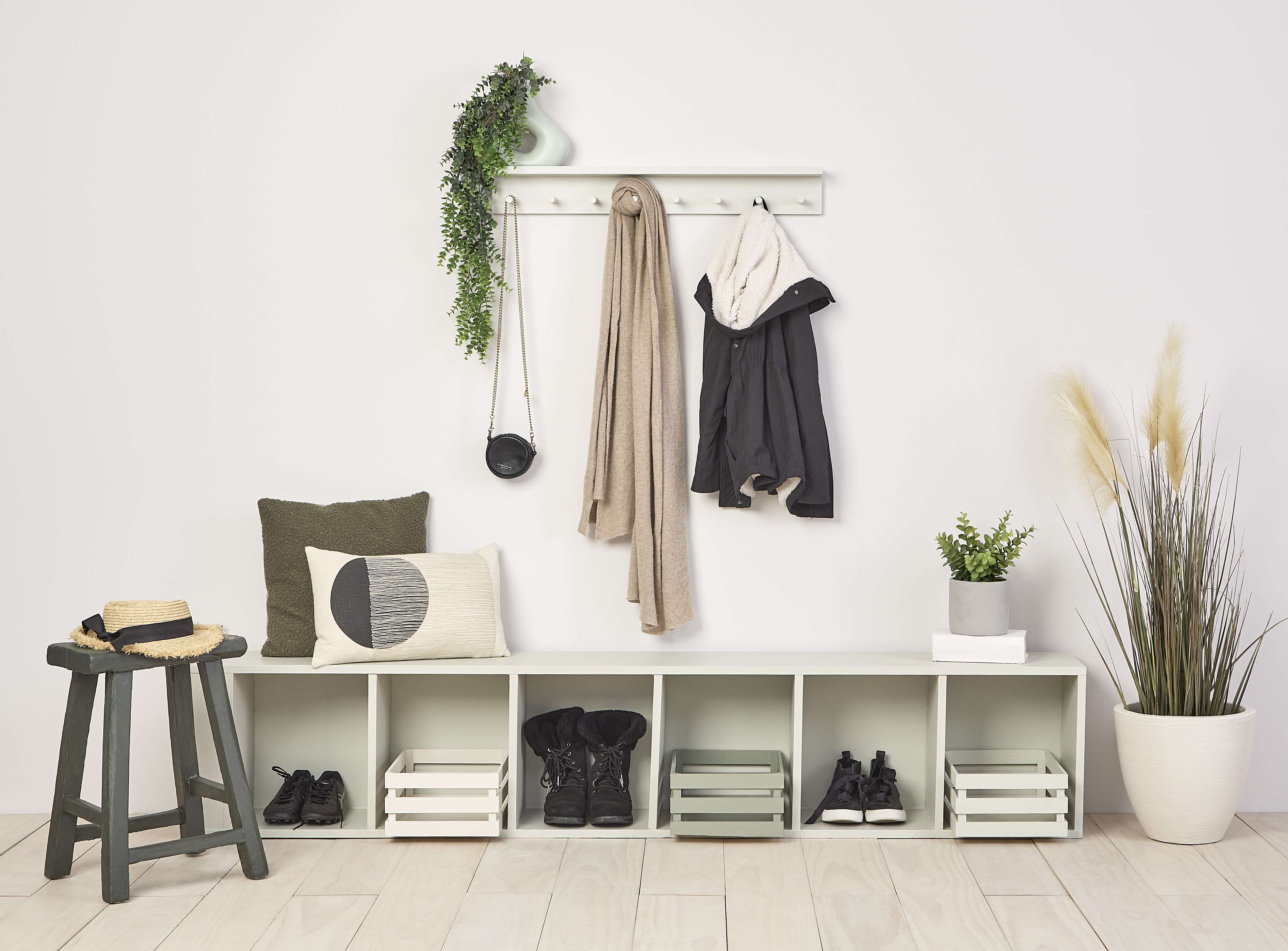
Accent notes in Resene triplestrength colours add texture and variety to a neutral colour scheme. Wall in Eighth Bison Hide, floors stain washed in Breathe Easy, hookshelf in Tana, bench seat in Quarter Tana, crates in Triple Rice Cake, Linen and Rice Cake. Stool in TripleLemon Grass. vase on shelf in Duck Egg Blue, large planter in Eighth Tana. Scarf from Maman, cushions from Freedom. Project Annick Larkin.Image Bryce Carleton.
Using these different variations of the same colour is one of the simplest ways to add variation to your finished colour palette without having to worry about what colours will work with each other, Amy says.
“Working with the different strengths of one colour is fail-safe; they will always work together. My main tip when pairing different strengths of the same colour together, particularly when testing out colours for your colour scheme, is to try a two-tone variation so it's easy to see the colour difference.”
Look at the Resene Whites & Neutrals palettes for shades like crisp Resene Rice Cake that come in eighth through to triple strengths. Choose one shade such as Resene Double Rice Cake as your main colour, with deeper Resene Triple Rice Cake on feature pieces like door, furniture or shelving, then add decor accents and trim in Resene Eighth Rice Cake through to Resene Rice Cake. The finish look will appear both monochromatic yet subtly shaded and layered.
Complete the look by adding texture in materials or using products like Resene FX Paint Effect Medium and showcasing wood grains with a stain using Resene Colorwood Natural.
Top tip: Remember darker colours aren’t automatically warmer colours. Triple strength Resene Sea - Resene Triple Sea Fog - is a darker misty grey than Resene Sea Fog, yet retains its cooler undertones tones.
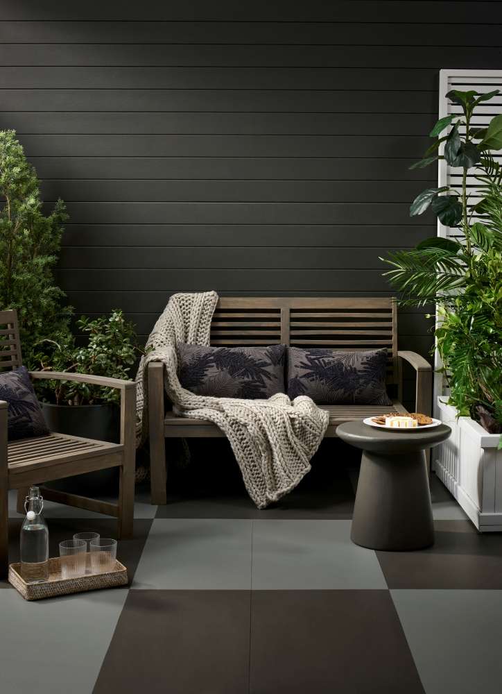
Triple strength charcoal shades can provide an elegant and textured alternative to classic black. Wall and table painted in Triple Dune, floor in Relic and Traffic, seating stained in Woodsman Iroko, trellis and planter box in Quarter Truffle, tray washed in Half Sea Fog. Cushions and throw from Nood. Project Megan Harrison-Turner, image Bryce Carleton.
When to use your triples
Each triple strength neutral in the Resene range offers different benefits or effects on your space. Cooler neutrals, like Resene Triple Black White and Resene Triple Sea Fog, provide a clean, crisp look that suits contemporary and classically minimalist interiors. They are perfect for spaces where you want a clean, fresh feel without the starkness of pure white.
While these crisp whites pair perfectly with Resene Black White and Resene Sea Fog, you can also try them with more delicate whites like Resene Quarter Alabaster.
Warmer neutrals, such as Resene Triple Tea and Resene Triple White Pointer, add warmth and depth, making them ideal for creating cosy, inviting environments. These shades are especially beneficial in rooms with less natural light, as their richer tones can make the space feel more welcoming.
For a warm, layered look that showcases Resene Triple Tea, try it paired with the muted off-white of Resene Quarter team and the deep cream of Resene Pavlova. For a warming addition of colour try accents of rich blue Resene Midnight Express, forest green Resene Bush or even burnt brick orange Resene Fire.
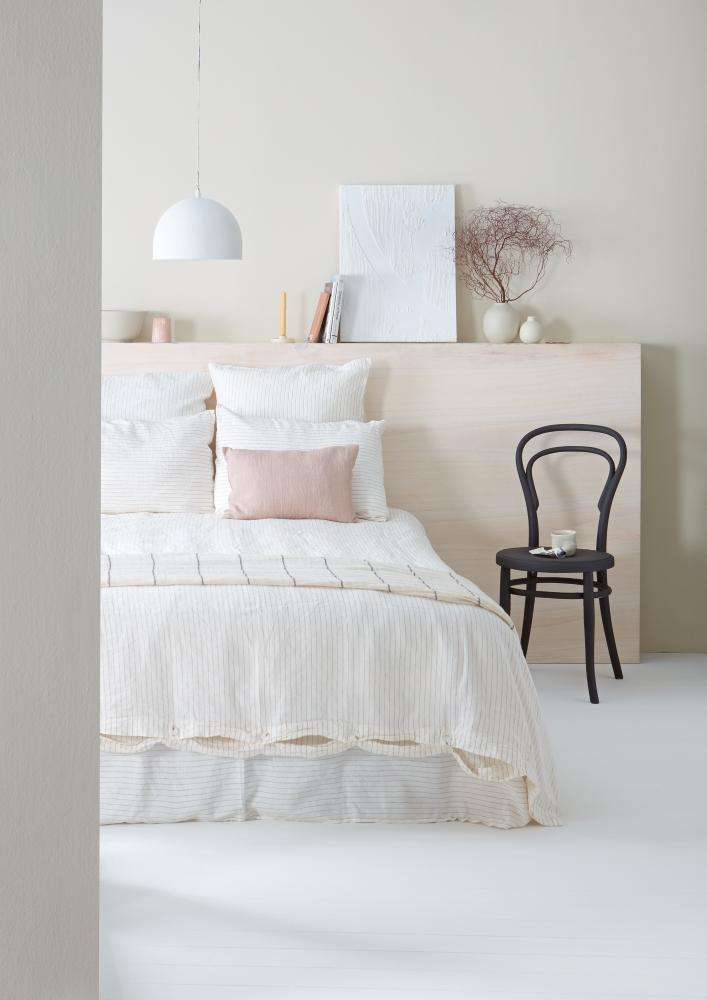
Triple strength neutrals can add depth and dimension but still allow for the finish look to be light and fresh. Wall in Triple Pearl Lusta, headboard stain washed in Colorwood Whitewash, floor painted in Eighth Pearl Lusta, DIY art in EzyFill Quick applied with grooved tool, top coated in Half Black White, shelf vases and bowls in Sourdough, and Half Bison Hide. Throw and candle holder from Blackbird Goods, bed linen from Foxtrot Home, cushion from Città. Project Gem Adams. Image Wendy Fenwick.
For modern, industrial-style chic try Resene Triple Concrete paired with classic crisp white Resene Alabaster and green-tinged grey Resene Triple Ash.
In larger, open-plan spaces, triple strength neutrals can help define different zones in the same room. Painting the dining area of an open-plan living space in Resene Triple Sea Fog when the rest of the walls are in a lighter neutral will add depth and contrast to define the space without dominating it. Additionally, these richer neutrals are excellent for high-traffic areas like hallways and entryways, where their deeper tones are more forgiving of scuffs and marks.
Top tip: Typically, the larger the wall you are painting, the lighter your paint can appear. Opting for a double or triple strength of your chosen colour may help offset that effect.
Don’t forget the dark
When we talk about neutrals we often immediately think of creams, whites and beiges but darker greys and or blacks can also play a strong role in creating simple, achromatic spaces that feel as clean and minimalist as classic whites.
Darker grey neutrals such as Resene Triple Friar Greystone offer a sophisticated alternative to black, providing depth without the intensity of a classic dense black. Use these dark triples as statement contrast on features walls, cabinetry, or even floors as a grounding element in a lighter colour scheme. Try Resene Triple Friar Greystone with the grey undertones of Resene Sea Fog or brown-toned charcoal Resene Triple Masala with soft olive beige Eighth Arrowtown or delicate grey-green Emerge.
“I love the triple tones that are dark and moody,” Amy says. “Colours like Resene Carpe Noctem, also known as Resene Triple Coast, and Resene Black Sand, also known as Resene Triple Foundry, are both charcoal shades with blue undertones that I think gives them a sense of mystery from within.”
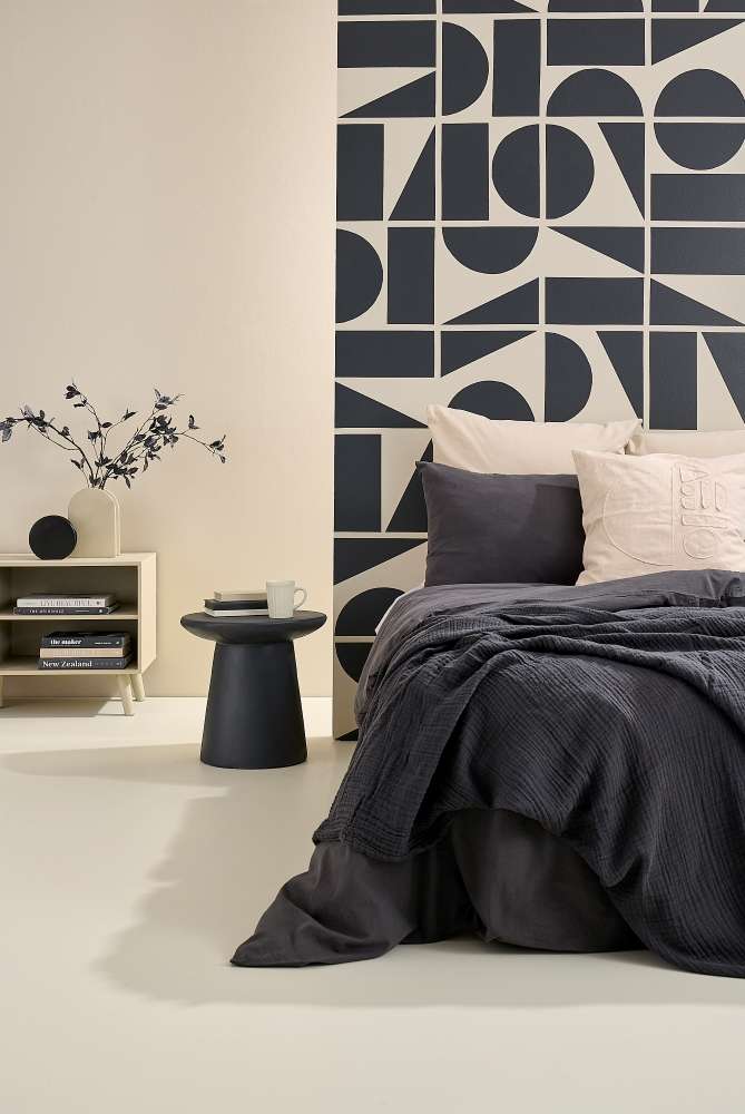
Layers of Parchment create a serene canvas for bold charcoal contrasts. The rearwall is Parchment with geometric mural, ball ornament and table in Foundry. Floor in Half Parchment, cabinet, arch vase and bookcover in Triple Parchment. Bed linen from Adairs. Project Vanessa Nouwens.Image Bryce Carleton.
Did you know? Some Resene triple strength colours are so popular they’ve been given their own Resene colour name. For example, Outlaw is the same as Triple Sandstone. If you can’t find a triple strength version of your favourite neutral, check with your Resene ColorShop as it may be available or staff can arrange for a triple strength to be made for you or find you a similar colour.
Triple the colour
Though triple strength colours work well as a deeper contrast in all-neutral colour schemes, many Resene triples also work well as the anchor neutral in bolder, colourful spaces.
Some combinations to try are green-toned beige, Triple Thorndon Cream with henna red Burnt Sienna and spicy mustard Lemon Ginger. Add fresh trim in Eighth Thorndon Cream. Try deep cream Triple Pearl Lusta with blackened purple Revolver or deep Racing Green.
Overall, Resene’s triple strength shades from the Resene Whites & Neutrals collection offer versatile and stylish solutions for a variety of interior spaces. Whether you’re looking to add depth, define zones or create a warm and inviting atmosphere, these richly pigmented colours provide the perfect balance of sophistication and functionality.
If you need help deciding which Resene triples suit your project best, come in and visit your local Resene ColorShop, Ask a Resene Colour Expert free online, www.resene.com/colourexpert or book a Resene Colour Consultation, www.resene.com/colouconsult.