When it comes to creating high impact in an interior space, it’s hard to go past the idea of immersing a room in a single colour, known as colour drenching
Resene colour consultant Connor Watson says colour drenching can give rooms a sense of total unity and harmony as well as making them feel inviting and luxurious.
“By using the same colour tone across multiple surfaces and elements within a room, such as walls, ceilings, trim, even furniture, you will create a cohesive and enveloping environment that can make a bold statement.”
Start your property search
Here are some things to consider before opting to go all-in on one colour.
Making it work
For those worried about using one shade in a room, Connor suggests thinking about texture as well as colour. He recommends working with different surface finishes with products like Resene FX Paint Effects Medium or Resene Sandtex Mediterranean effect, and different sheen levels in paints like Resene Enamacryl gloss, Resene Lustacryl semi-gloss, Resene SpaceCote Low Sheen or Resene SpaceCote Flat, while keeping to your chosen colour.
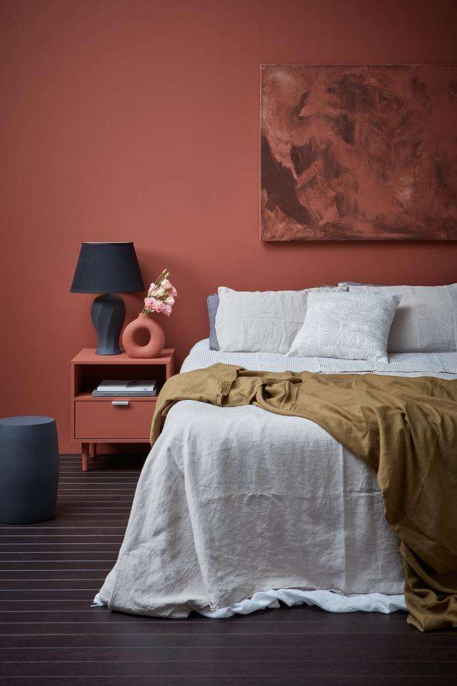
Touches of contrasting colour area great way to take the principles of colour drenching and personalise them toyour taste. Wall, vase and cabinet painted in Half Hairy Heath, floorwashed in Colorwood Bark, art in Half Hairy Heath and Shark and lamp and stool in Shark. Bedding from Foxtrot Linen. Project byAmber Armitage, image by Wendy Fenwick.
Breaking up your drenched colour with different textures, or other features like wood battens and wainscoting gives your eye different things to “grab” within the space so it feels accessible and welcoming.
“You should also consider the light reflective value (LRV) of the finishes in your room,” Connor says. You can find the LRV value on the Resene colour charts. A higher LRV, light whites and pale neutrals for example, reflects more light and helps make a room feel brighter and airier. Lower LRV colours, like deep blues and greens or black, will reflect less light for a cosier, more dramatic look.
Top tip: if you want a classic minimalist all-white drenched look, consider an off-white like Resene Parchment or Resene Quarter Drought rather than a bright white to avoid too much glare.
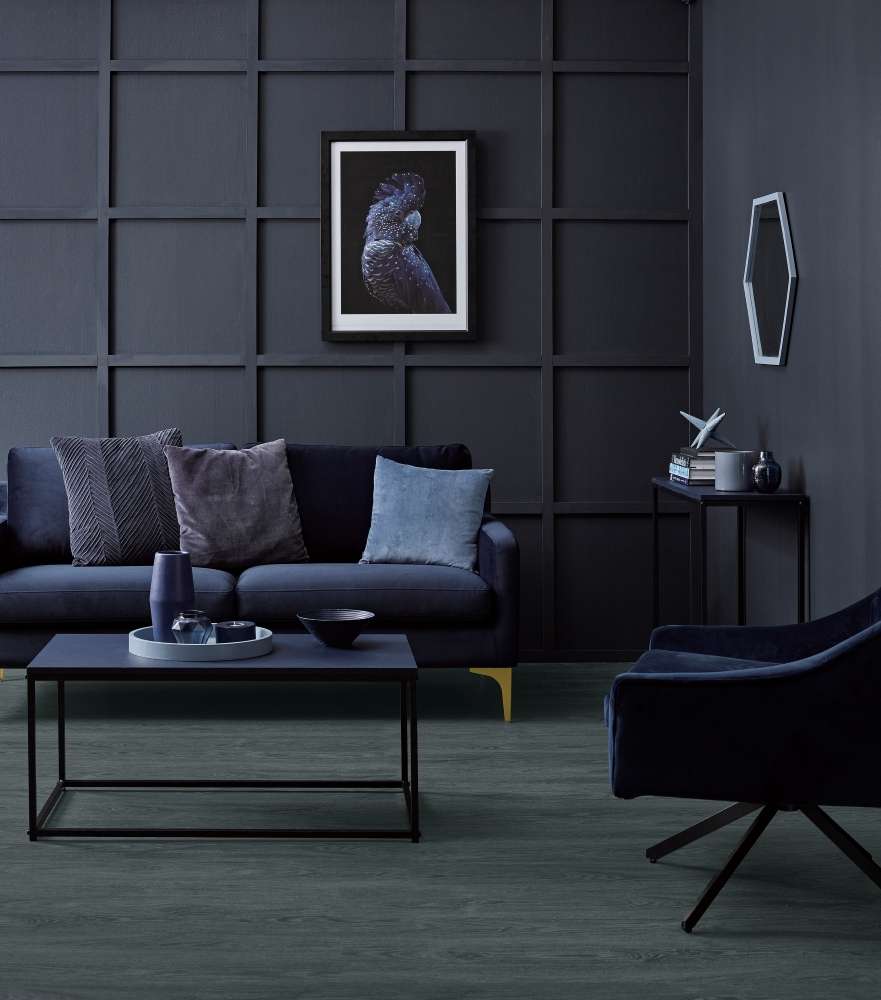
Texture from the wood grain floors andwall battens adds visual interest and impact in this cosy, sophisticated livingroom. Walls painted in Twilight Zone, floor stain colour washed in Colorwood Crowshead, coffee table and sideboard in Indian Ink,vase, tealight holder and bowl in King Tide, tray, pot, star ornamentand mirror frame in Excalibur and coaster in Time After Time.Cushions from Nood and H&M Home, chair from Nood, sofa from Contempa, artworkfrom Pop Motif. Project by Vanessa Nouwens, image by Melanie Jenkins.
“Think about how dark or intense you want the space to feel,” Connor says. “If you're aiming for a cosy feel, deeper tones like Resene Plum or Resene Vanquish can be ideal. For a dramatic effect, more saturated, rich hues like Resene Grapevine or Resene Rock N Roll can work wonders.
“Observe how the colour reflects on itself. Avoid tones that have a strong reflective quality, as they can amplify and become overpowering when applied to large surfaces. A colour that appears subtle on a swatch can feel intense when used extensively.
“The key is understanding the amount of natural and artificial light in the space, as it influences how the colour will appear. Resene testpots can be a big help, as can the experts at your Resene ColorShop.”
Degrees of drenching
If you like the idea of drenching but are a bit daunted by it, there are some ways to experiment without committing to dramatic use of a bold shade you’re worried you might not like.
For a start, you can adopt the drenching approach, painting even furniture, decor and fittings in your chosen single shade, but work with paler, muted or pastel shades for a high impact that still feels delicate and fresh. Try dusty pink Resene Dust Storm, fresh peach Resene Wax Flower or biscuit beige Resene Sand.
Connor’s number one tip for getting the full impact of a colour drenched space, even with softer colours, is to remember the fifth wall; the ceiling.
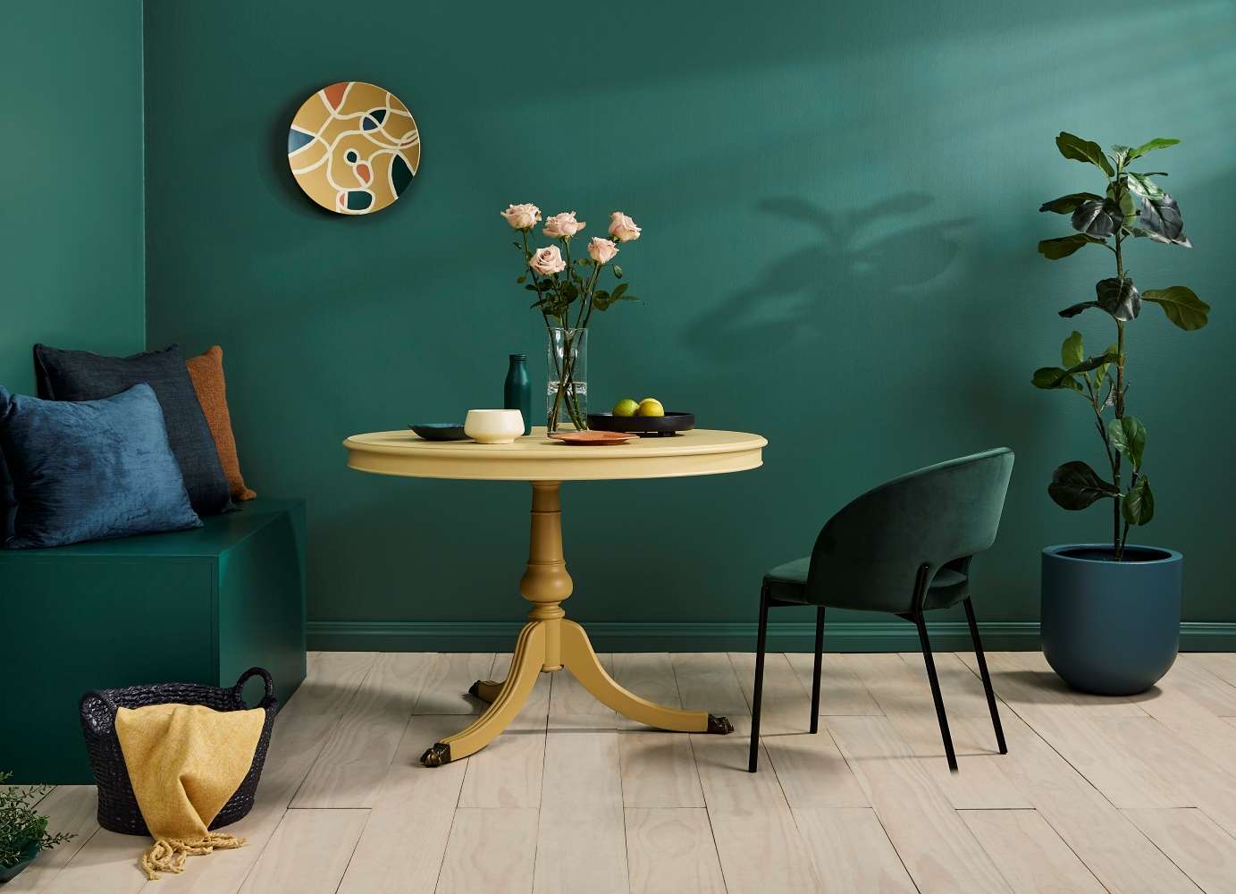
Jewel-toned greens envelope this diningspace, creating warmth and luxury. Walls and skirting painted in Stromboli, floor stain colour washed in Colorwood Breathe Easy, benchseat in Deep Teal, basket in Bastille, table legs in Teak,tabletop in Putty, oblong plate and planter in Casal, bowl in Popcorn, octagonal plate in Tuscany, bottle in Deep Tealand tray in Bastille. Project by Moneuan Ryan, image by Bryce Carleton.
Applying your chosen shade to the ceiling of your room, instead of opting for a traditional white, will immediately change the feel of your space, emphasising the sense of being enveloped - or drenched - in colour.
If you’re opting for a richly colour drenched space in a bold shade like leafy green Resene Deli or opulent blue Resene Cobalt, but are worried the space will feel too small, Connor suggests keeping to the same hue, but in a lighter shade like delicate mint Resene Kandinsky or soft grey-blue Resene Smokescreen.
The opposite approach also works, Connor says, if you want drama without colour intensity in your room. Try your deep shade, such as Resene Palm Leaf on the ceiling and drench the rest of the space in soft grey-green Resene Xanadu. This can work particularly well in spaces with high ceilings that you want to feel light but cosy.
“Ceilings are often left white, but introducing a rich or unexpected hue can add a dramatic flair without overwhelming the entire room,” Connor says.
Another way to work with the principles of colour drenching is to layer different intensities or analogous shades of the same colour within your room. If you want to create a calming, restful blue bedroom but don’t want to go all-in on one shade, pick your favourite as the base colour, then work with other similar shades on accent pieces, trim and furniture. Team walls in deep blue Resene Tarawera, with a ceiling in Resene Nepal and layers of decor in shades like Resene Navigate, Resene Undercurrent and Resene Bali Hai.
The Resene colour palettes available at your local Resene ColorShop will help you work out which shades will layer well together. Another approach is to work with the mid-toned neutrals in the Resene Whites & Neutrals collection and use them in different intensities from eighth strength through to triple strength. A good neutral to use is Resene Sisal a warm beige, then bring in the wider colour spectrum from the subtle off-white of Resene Eighth Sisal to the rich, greened ochre of Resene Triple Sisal.
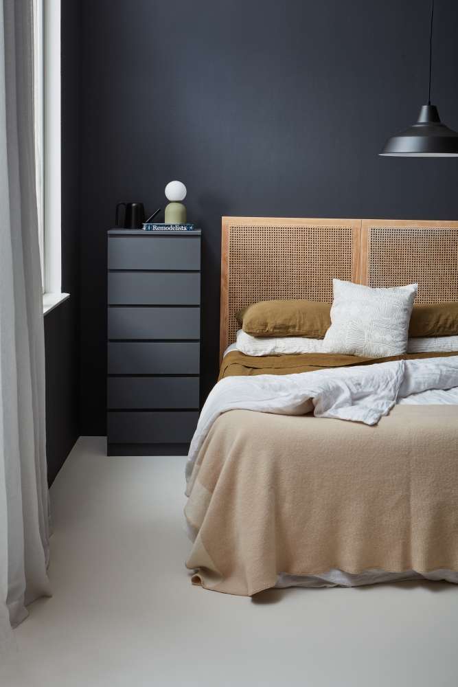
Naturaltextures and materials and a neutral floor add freshness to the layers of deepblue in this bedroom. Walls and drawers painted in Shark, window andfloor in Bubble White and lamp in Siam. Bedhead from Mocka,bedding from Foxtrot Linen, pendant from Lighting Plus. Project by AmberArmitage, image by Wendy Fenwick.
Adjust the contrast
The other way to lighten and elevate a colour drenched space is to have just one impact feature in a dramatic contrast shade. A single lightshade or decor piece painted in shimmering Resene FX Metallic Gold will beautifully break up a deeply colour-drenched room in charcoal Resene Grey Friars or navy Resene Coast. A contrast piece of furniture painted in deep maroon Resene Cab Sav will be a highlight in a room drenched in smoky greige neutral Resene Napa.
There are no hard and fast rules for colour drenching your space. Start with one colour you love and bend the rules, adding texture and contrast as you need to, to create the look you want.
If you need help getting starting or deciding on the colours that best suit your home whatever the season, come in and visit your local Resene ColorShop, Ask a Resene Colour Expert free online, www.resene.com/colourexpert or book a Resene Colour Consultation free instore or virtually or a paid home visit in selected areas, www.resene.com/colourconsult.