Warmth is so often the feeling we chase when we’re designing certain rooms in our homes, particularly living and relaxing areas like bedrooms, dining rooms, TV rooms and lounges.
Rich, saturated shades in deep bold hues are a short-cut to warmth and appealing cosiness and, arguably no colour does it better than a deep shade of red.
Though it can be a little intimidating at first thought, red is a surprisingly versatile shade, and when you work with the right moody tone, the results are bold yet sophisticated and classic.
Start your property search
Colour-saturated redslend themselves to luxurious and sophisticated looks. Walls painted in ReseneIncarnadine, floor painted in Resene Athena, DIY artwork in Resene Heliotrope, Resene Incarnadine, ReseneFunk, Resene Solitaire, Resene Dawn Glow, Resene Arriba, Resene Pandemonium,Resene Solitaire and Resene Athena. Chair, ottoman and drum table from SorenLiv, vase and flowers from Urban Flowers, rug from Baya. Project Amber Armitage. Image WendyFenwick
“Red isn’t for the faint-hearted, but combined with the right shades in your palette, red can bring just the right amount of drama to a room,” says Resene colour consultant Meryl Southey.
Dark, rich reds with purple or rich quieter rooms like bedrooms, dining rooms or sitting rooms try darker rich reds with raisin or earthy brick undertones for the feel of a classic homestead, Meryl suggests.
Tasting the right red
If you like the idea of red but are still feeling a little unsure about making the bold commitment, a good place to start is to look at the full spectrum of Resene’s wine reds, which run the gamut from deep plum Resene Rustic Red, through classic burgundy Resene Merlot, to more mid-toned Resene Vanquish, and on to more muted, yet moody reds like Resene Persian Red and the almost garnet Resene Cab Sav.
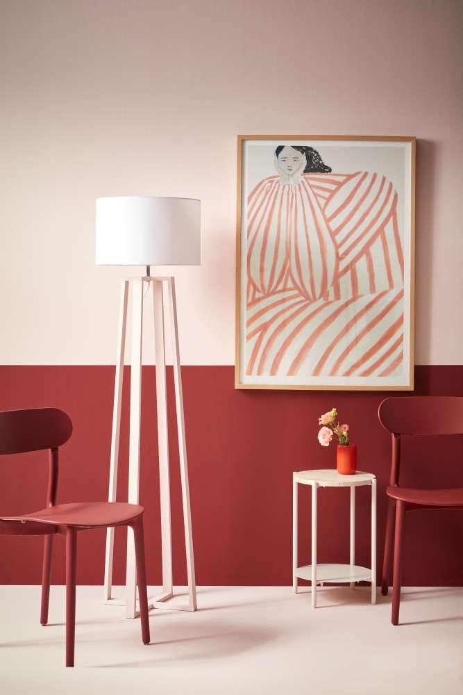
Abold red effectively anchors the ethereal pink of this room. Upper wall, floor,table and lamp base painted in Resene Dust Storm, lower wall and chairs inResene Avante Garde, vase in Resene Thunderbird. Project: Amber Armitage. Photo / Wendy Fenwick
As with any bold, darker shade, it’s important to try your favourite Resene deep reds in your space, paying particular attention to light, both natural and artificial, to make sure you’re happy with how the light plays against your colour. If your room is naturally cooler, or on the south side of the house, look to deep reds with warmer undertones like Resene Pohutukawa or Resene Rustic Red to bring cosiness. For rooms that feel naturally warm try cooler undertoned shades like Resene Dynamite or Resene Merlot.
Once you have those colours in place, think about whether you want to intensify the sense of cocooning comfort, or pair your rich reds with palette cleansing, fresh neutrals or contrasts.
For a cocoon, try layering a heritage red like Resene Red Oxide with a slightly coppery-red like Resene Lusty, and desert red-brown Resene Redwood. For a velvety wine red look, try layers of Resene Merlot with other rich reds like Resene Aubergine and Resene Cab Sav. It can also work well with muted charcoal neutrals like Resene Oilskin for added drama.
Top tip: To maximise the luxe feel of your deep reds on walls use a low-sheen or matte finish such as Resene SpaceCote Low Sheen or Resene SpaceCote Flat for a suede-like finish.
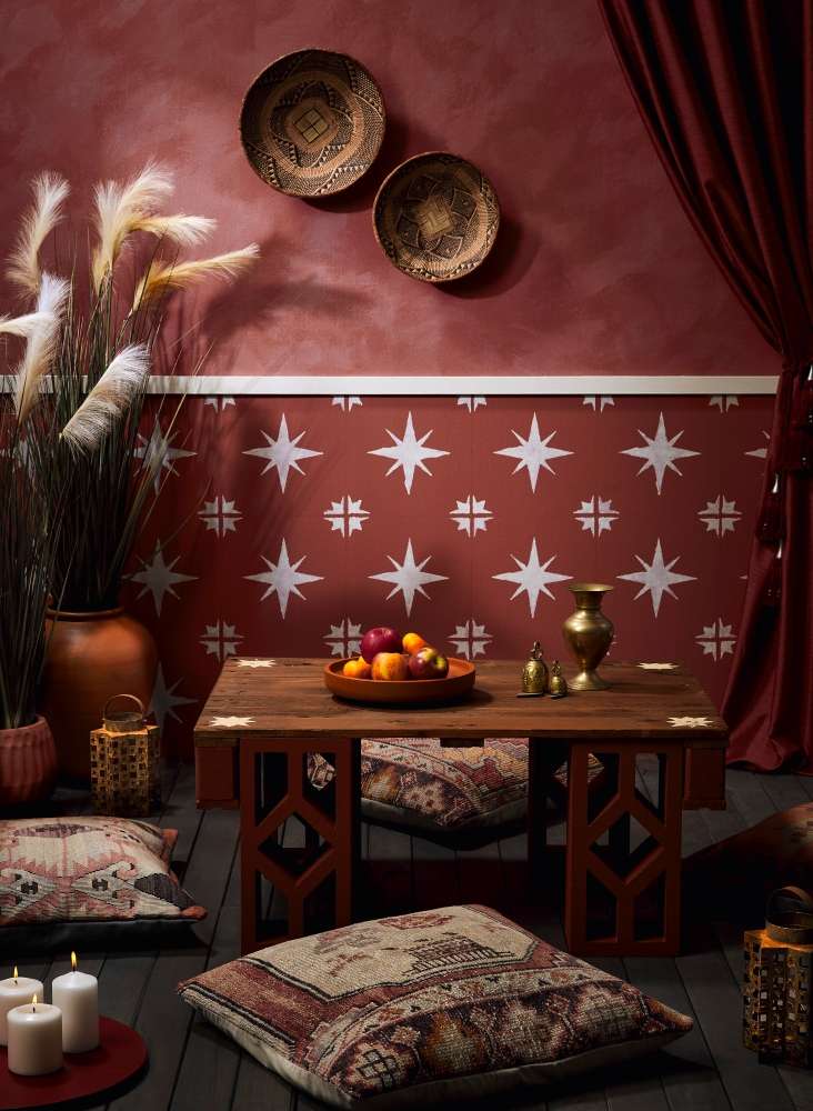
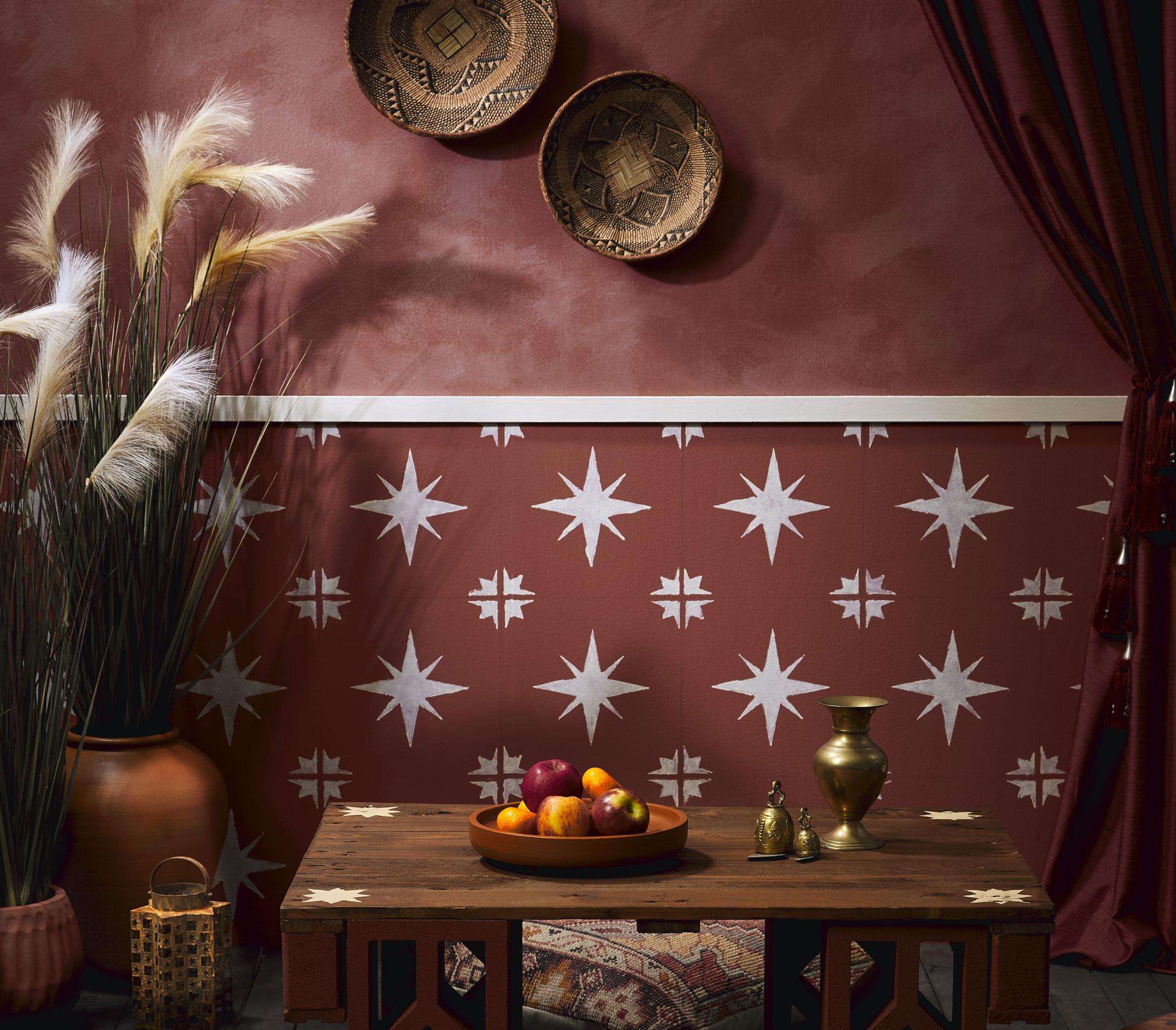
A stencil pattern and paint effects addflair and contrast to a deep red outdoor entertaining area. Upper wall paintedin a base of Resene Apple Blossom topcoated in Resene Quarter Solitaire mixedwith Resene FX Paint Effects Medium, lower wall in Resene Apple Blossom withpattern and dado rail in Resene Solitaire, table top stained in Resene WoodsmanBark with stencil design in Resene Manhattan, floor in Resene Woodsman Tiri,lanterns in Resene FX Faux Rust Effect, breeze blocks in Resene Mocha, pots inResene Cinnamon and Resene Mocha, fruit bowl in Resene Cinnamon, candle tray inResene Burgundy. Cushions from Yuva. Project: Melle van Sambeek. Photo / Bryce Carleton
If you prefer some freshness with your rich reds, try peppery or brick tones like Resene Salsa with versatile off-whites like Resene Double Merino or creamier Resene Thorndon Cream. For more purple-hued reads like Resene Pandemonium, try a delicately green toned neutral like Resene White Noise and add contrast notes in soothing yellow Resene Illuminate or spicy orange Resene Kombucha.
For a blue-toned maroon like Resene Rustic Red look to green-greys like Resene Tana or classic white Resene Sea Fog, and to up the drama, add key accents in olive Resene Seaweed.
Meryl adds that if you want to go down the deep red route, remember you don’t have to go all in. Even touches of these bold shades will add intensity and visual impact. “These shades will always enliven your space, so it becomes about balance to make sure the space feels inviting and not chaotic.”
Other colour combinations to try:
- Resene Cab Sav with soft apricot Resene Wax Flower and botanical Resene Spanish Green;
- Resene Volcano with mid-toned neutral Resene Half Tea, and deep cream Resene Putty;
- Resene Vanquish with fresh olive Resene Frontier and rich beige Resene Alpaca;
- Resene Persian Red with citrusy Resene Lemon Twist and moody Resene Blue Night, and
- Resene Lip Service with pastel aqua Resene Swans Down and vibrant Resene Riptide.
The element of surprise
If you have a largely neutral colour palette throughout your home, one way to get maximum impact from your rich reds is to colour-drench one room in them so you open the door to a dramatically different surprise from the rest of the house.
It would work well in a guest bedroom, spare bathroom or media room, even a master bedroom. The visual contrast between a versatile, subdued neutral colour palette through the heavy traffic areas of your home, move to a bold dark red space behind closed doors will double emphasise the impact of your reds.
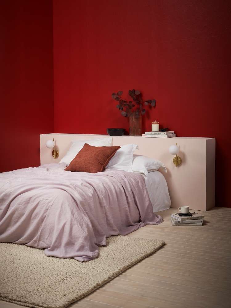
Acolour-drenched room in deep red creates a cocooning and cosy bedroom. Wallspainted in Resene Aroha, floor washed in Resene Colorwood Breathe Easy,headboard in Resene Inspire, bowl in Resene Black. Lights from Kmart, beddingfrom Foxtrot Home, books and mug from Father Rabbit, cushion from Baya. Project: Amber Armitage. Photo / Wendy Fenwick
To keep the colour-drenched room feeling thematically connected to the rest of the house, use one or two accent notes of red in other rooms - on a painted decor piece, a picture frame, or a single piece of furniture.
Soften the impact
If a colour-drenched room in deep red is a step too far, think about a single feature wall or even a single high-impact drop of colour behind a couch or sideboard. Bold reds can also work well in unexpected places like floors, or even ceilings; a great option to manage the proportion of your room if you have high ceilings.
On the floor go for high impact with two-tone checkerboard look, using Resene Walk-On paint tinted to pinot-hued Resene Incarnadine, with greyed white Resene Black White for a modern take on a classic look.
Top tip: For a painted checkerboard floor, paint the whole floor in two coats of Resene Walk-On in your lighter shade. When fully dry, mask out your check pattern and topcoat with your deep red.
A soft, blurring effect can be another effective way to get the drama of a bold red without overwhelming your space. Try a basecoat in a rich but rich red like Resene Lusty, then add a top coat of Resene Shiraz mixed with Resene FX Paint Effects Medium mixed and apply in a dappled effect with a large brush or a sponge to create a colourwashed look. Resene FX Paint Effects Medium helps give your surfaces this slightly weathered or handcrafted effect that can soften the impact of a bold shade, while keeping your look unique and dramatic.
Top tip: Always try your paint effects on a sample section first and keep note of the recipe for the look you like best so you can recreate it.
Deep, moody reds are a powerful tool in your interior design toolbox and it only takes a little forethought and preparation to make the most of them in any room.