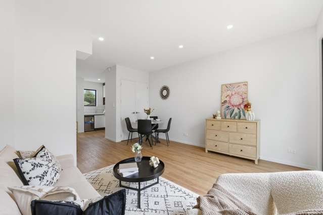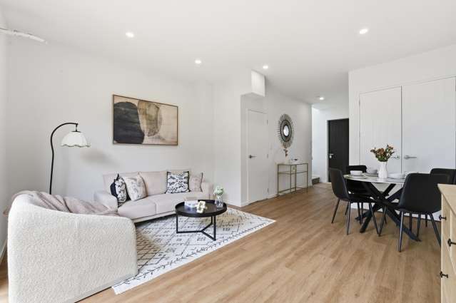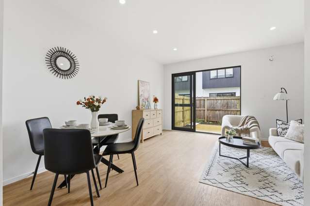
Bright, breezy interiors feel perfect through summer, but as the air turns crisp there’s a natural pull toward rooms that feel warmer, softer and more enveloping.
That doesn’t mean you need to do a full seasonal makeover! The shades of autumn like burnished golds, spicy coppers and baked earth tones, make for a mutable colour palette that can easily be cosied up or cooled down depending on the mood, taste or temperature.
Simply dial the mood up or down by swapping textiles and textures, lighting and accessories, or even small areas of feature accent colours.
Building on a base
Start your property search
For Resene colour consultant Amy Watkins warm neutrals are a great foundation on which to build an autumnal colour palette.
“Neutrals like Resene Thorndon Cream, Quarter Fossil or Eighth Akaroa will instantly create a sense of comfort and warmth within your interiors,” Amy says. “Bring the space to life by pairing these softer tones with rich statement colours, either as a feature wall or in a statement room.”
Neutrals like these and other mid-toned shades are the quiet achievers of an autumnal colour palette. Others to try are Triple Spanish White and Triple Pearl Lusta, as well as lighter variants like Spanish White, and Half Pearl Lusta, which help the colour “temperature” of rooms to shift effortlessly between cosy winter retreat and lighter summer haven.
Copper-tonedlayers of spiced colour make this autumnal sitting room glow with warmth. Rearwall is Resene Dark Buff, and the lower shelf wall is Korma. Project / GemAdams. Photo / Wendy Fenwick
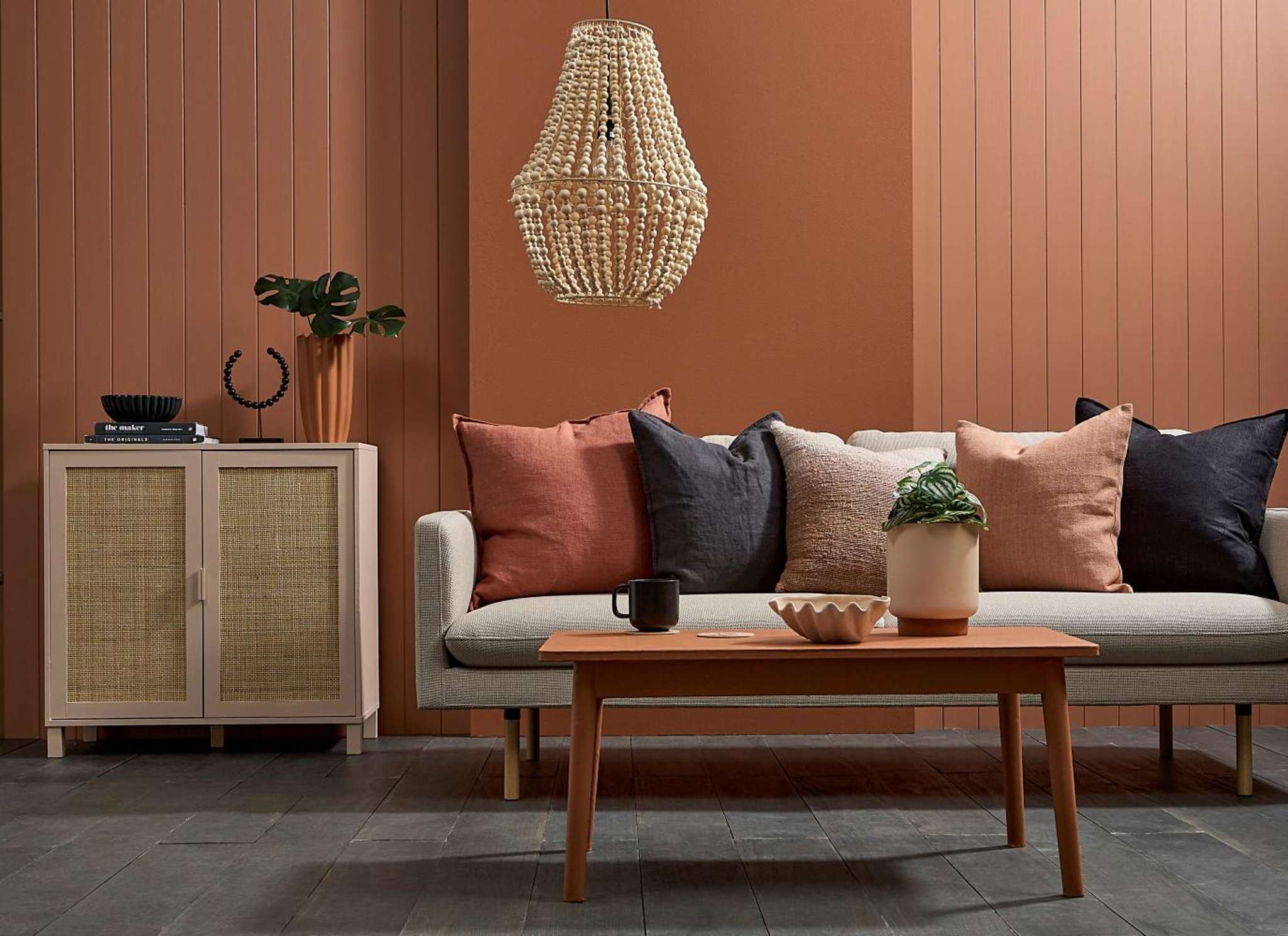
Off-whites with gentle grey undertones, including Athens Grey, House White and Merino, provide a flexible backdrop for deeper seasonal accents like greige, charcoal or terracotta tones in Soiree or Amaranth. Metallic touches in copper or brass add a subtle glow reminiscent of autumn light.
If you prefer a lighter approach, warm whites with a hint of yellow, Resene Spanish White or Resene Solitaire, keep spaces bright while still feeling snug when layered with texture and pattern.
From there you can build a palette that suits your tastes and interpretation of autumn.
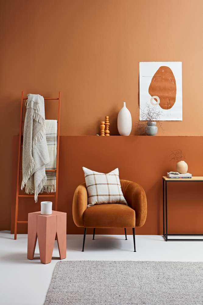
“Earthy shades such as Tuscany, Wild West or Hemlock will add depth and sophistication, creating a beautifully layered, autumn-inspired interior,” Amy says.
“Adding these autumnal colours into your interior palette is a good way to create a space that feels warm, inviting and comforting. These tones naturally reflect what we see outdoors during the cooler months, which helps interiors feel more connected to nature and more grounding.”
To give these natural and earthy tones extra lift, while keeping to an autumnal theme, Amy suggests pairing them with deep blue greens like Dark Slate or Jurassic, or dusty pinks such as Sakura or Wax Flower for a contemporary softness.
Literally leafy
For a clearer reference to autumn beyond simply colour, you could turn to the most obvious autumnal motif: falling or golden leaves.
Here, wallpaper can be your best friend. You could try the colourful but muted leaves of Resene Wallpaper Collection Perfect Harmony PH3011, or the more subtle and abstract leafy imagery of A67602.
An autumnalcolour scheme can just mean touches of the right warm shade against a warmneutral backdrop. Wall design in Resene Cumin, background wall and skirting inWhite Pointer, floor in Half Raven. Project / Laura Lynn Johnston. Photo / Melanie Jenkins
Try these patterned papers - or even a simply autumn-hued design like Wallpaper Collection Perfect Harmony A64902 - as accent features in a living room, dining room or bedroom, perhaps as a feature wall, or a single drop behind a couch or showcase art piece, then find paints that match shades of the wallpaper, such as Pirate Gold or Half Forest Green, to use around your room.
If you love a more densely or intricately patterned autumnal design like Resene Wallpaper Collection Aquila ILA102, but are unsure how it will look in larger quantities, consider applying smaller sections of wallpaper to a stretched canvas or within picture frames. This will give you autumnal accents, that you can match to those beige-toned or creamy neutrals like Desert Sand or Solitaire. They can also easily be moved around or switched out if you want more of a seasonal change in your room.
For those wanting to try their artistic skills, experiment with your own falling leaves mural, using freehand painting or stencils. Even two or three simple leaves falling down a wall can be an effective nod to an autumn vibe.
Top tip: Experiment with Resene FX Paint Effects Medium to give your leaves a naturalistic, distressed finish. Try sponging shades like Haystack, Tarzan and Double Spanish White mixed with the medium. Test your ratios and technique on a spare piece of wood or plasterboard before committing to the wall.
Cocoon with colour
Autumnal decorating isn’t just about going darker. Creating a cocoon feeling can be more effective if you opt for soft, muted tones. Extending a gentle shade such as Resene Cashmere across walls and ceiling wraps the room in colour, changing how light moves through the space and creating an intimate, sheltered feel without heaviness.
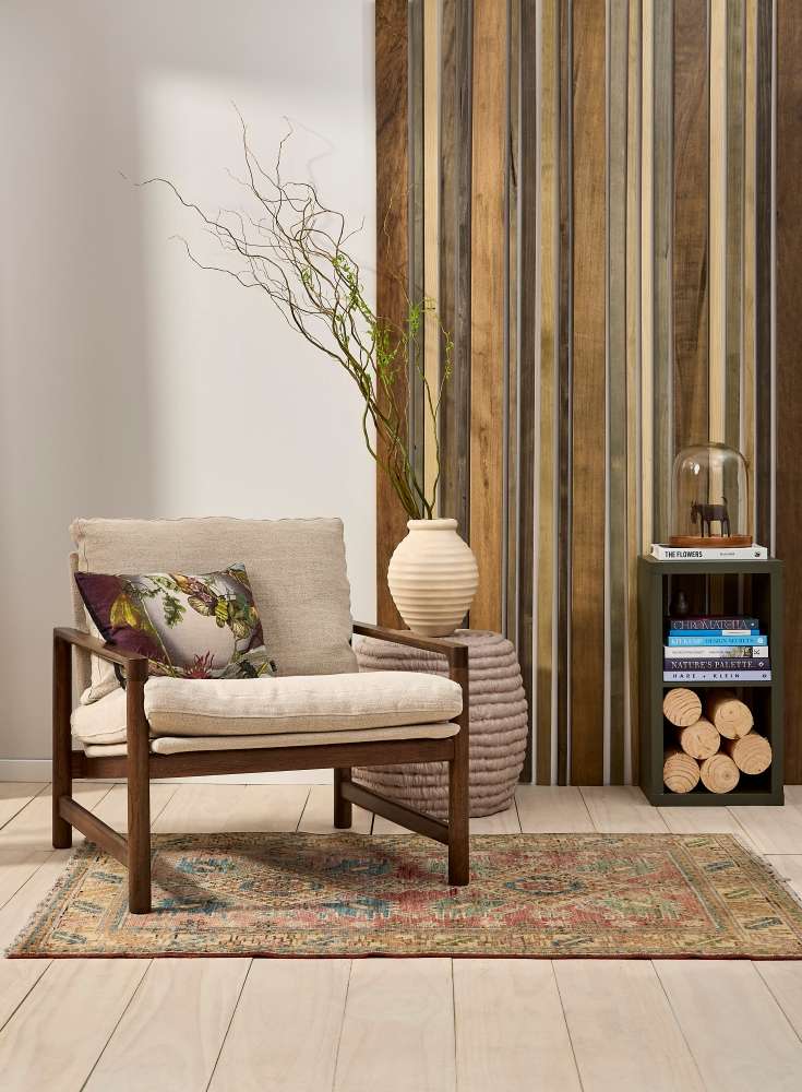
Showcase textures, such as natural wood finishes to bringyour autumnal look to life. Wall in Resene Westar with wood feature in ReseneWoodsman Cedar Natural Wood Oil in Tararua, Kahurangi, Paparoa, Fiordland, MtRichmond and Aotea, skirting in Eighth Rice Cake, floor washed in ReseneColorwood Breathe Easy. Project / Katrina Hobbs. Photo / Bryce Carleton
Using flat or low-sheen finishes like Zylone Low Sheen or SpaceCote Flat can also help create the sense of being cosy and cocooned by softening light reflection and deepening colour. For the ultimate retreat, try colour drenching, which means painting walls, trim and even furniture in one enveloping hue. Spicy browns and wine tones such as Avant Garde, Dusty Road or Saratoga create intimate guest rooms, media spaces or reading nooks that feel made for cooler, cosier nights.
Chocolate-rich shades are another autumn hero and very much on-trend. Colours such as Dark Rum, Bokara Grey, Cioccolato or Milk Chocolate deliver drama with warmth, especially when paired with lighter companions like Sour Dough or Okey Dokey to stop the look feeling too heavy.
Sunset warmth
Few palettes capture the essence of autumn quite like terracotta, clay and peach. Shades such as Tuscany, Sunglo and Alert Tan evoke both sun-warmed landscapes and fallen leaves, bringing a grounded warmth that still feels connected to the outdoors.
These hues pair beautifully with nature-inspired greens, from earthy Quarter Karaka to the richness of Avocado or the deep blue-green of Tarawera to create spaces that feel restorative and seasonal without losing freshness.
Finish with texture
Colour doesn’t need to do all the work in an autumn palette. Texture adds the depth that makes autumn interiors feel inviting rather than heavy. Think timber battens, wool throws, linen upholstery, plaster finishes or tactile wallpapers such as Resene Wallpaper Collection Unify E300571 or E333207.
For a softer, weathered look, a colourwash or limewash effect created with FX Paint Effects Medium adds movement and a gently aged character, like walls that have mellowed over time.