When we think about autumn, or more wintry, colours to be used inside our homes, we immediately and, not surprisingly, think of warmth.
Rich browns, toasty neutrals, burnt and spicy terracottas, and even stormy charcoals all speak to us of hunkering down in comfort and warmth, making them perfect shades to embrace in your home. The good news is, with the right combinations and contrasts, you can create an autumnal interior that will still feel uplifting, comfortable and light, come summer.
Anchor in neutrals
Very few of us are going to go to the expense and effort of redecorating every season, so Resene colour consultant Meryl Southey says putting some time and thought into choosing your colour scheme will help ensure it can be adapted to how you want your house to feel at different parts of the year
Start your property search
“Transitioning from summer to autumn need not be a major task if you use colours that can be easily adapted from one season to the next,” she says. “Adding layers of texture is also a good way to change the look and feel of a room, particularly if you want to add a sense of warmth going into cooler seasons.
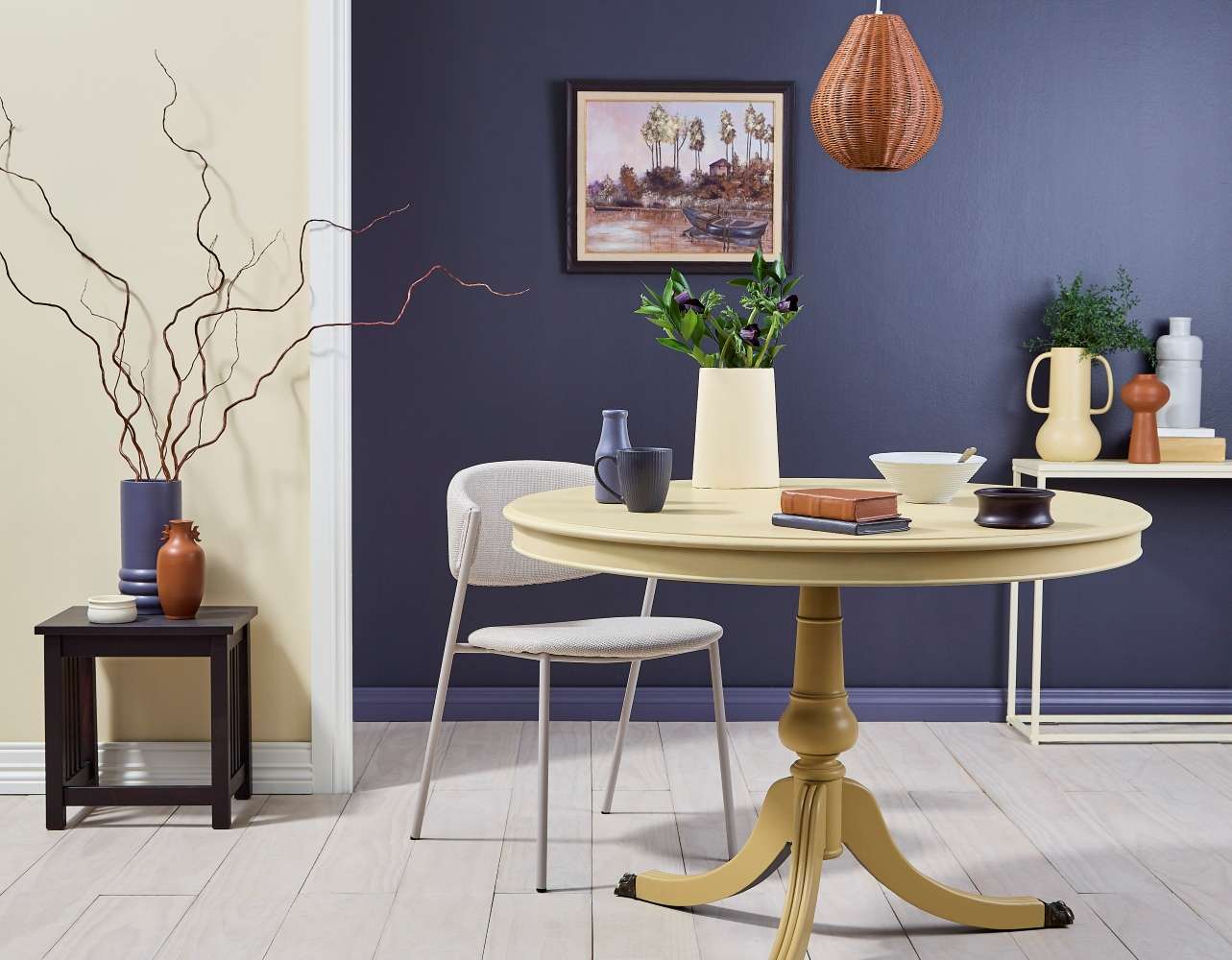
This dark-light combination of blue andcreamy yellow adds both warm and light to this dining area, transcending anysense of different seasons. Right wall painted in Resene Revolver with skirtingin Resene Mulled Wine, floor stain washed in Resene Colorwood Breathe Easy,left wall in Resene Astra, with skirting and trim in Resene Half Gin Fizz, dining table legs inResene Teak, table top in Resene Putty. On table, milk bottle in Resene MulledWine, mug in Resene Revolver, vase in Resene Astra, light bowl in ReseneTruffle, dark bowl in Resene Colorwood Deep Purple, books in Resene Cumin andResene Revolver. Side table stained in Resene Colorwood Deep Purple, tall vasein Resene Mulled Wine, small vase in Resene Cumin, dish in Resene Half Astra.Console table in Resene Astra, handled vase in Resene Putty, vase Resene Cumin, bottle in Resene Truffle, large book inResene Teak, small book in Resene Half Gin Fizz. Pendant light in Resene Cumin.Picture frame in Resene Colorwood Deep Purple, overpainted artwork in ReseneHalf Gin Fizz, Resene Putty, Resene Mulled Wine, Resene Astra and Resene Cumin.Project: Moneuan Ryan. Photo / BryceCarleton
“It can be organic texture like wool, or beautiful wood grains, or you can start adding layers of surface texture using products like Resene Sandtex, which adds a scrumptious texture to the walls.”
If you don’t want to go to the effort of adding texture to a whole wall, or room, use Resene Sandtex on small areas like around a fireplace, on a mantle or around a bookshelf. It’s a particularly effective way to break up a room, if you have a monochrome or very simple palette.
Top tip: Another way to add a sense of texture to your space is to try a limewash or sponged paint effect using Resene FX Paint Effects Medium. Paint your surface in a base coat of your chosen colour, then mix a second top coat colour with Resene FX Paint Effects Medium and apply. Always test on spare wood or wall board before applying to walls.
“Texture just adds visual warmth, especially if you’re working with whites or pale neutral colours,” Meryl says.
Another way to add warmth to a neutral or minimalist colour scheme is to find shades which can morph between cool and warm, she adds. “Not only do these neutrals help make summer feel like it’s lingering in your home as long as possible, they will transition more easily if you want to change some of your interior colours to warmer tones in cooler months.
“These whites and neutrals can be manipulated to feel warmer or cooler depending on what accents you combine them with. Shades like Resene Half Sea Fog, Resene Milk White, Resene Half Thorndon Cream, Resene Half Linen, Resene Quarter Lemongrass and Resene Half Napa have cool-toned bases but have hints of warmth within them, which can be enhanced by, depending on the aspect of the room, artificial lighting, swapping out accessories in different colour depending on the season.
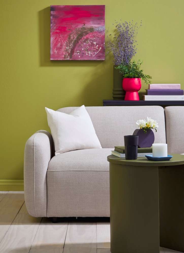
Switching out bold pops of unexpected painted colour onvases, art and furniture, is the fastest, most cost-effective way to adjustyour colour palette to suit the seasons. Wall and skirting painted in ReseneGinko, floor stain washed in Resene Colorwood Breathe Easy, candle tray inResene Panorama, side table, tall vase and small book in Resene Waiouru,console table and tumbler in Resene Revolver, pedestal vase in Resene Vibe,flat round vase in Resene Chapta and Verse. DIY artwork in Resene Vibe, Resene Revolver,and Resene Waiouru. Couch and cushion from Dansk Møbler. Project: MoneuanRyan. Photo / Bryce Carleton
To warm up a versatile neutral like Resene Quarter Lemongrass try with a layered neutral palette in whites that have a warmer yellow undertone like Resene Half Spanish White or off-white Resene Fossil. A combination of these neutrals can be cooled down with accessories in Resene Half Mondo, or Resene Jimmy Dean. Come autumn, add picture frames, or painted decor pieces in toasty shades like rich ochre Resene Bullwhip or deep red Resene Dynamite.
A versatile neutral like Resene Quarter Lemongrass will also work well when layered in your room in all its different strengths from delicate grey-green Resene Eighth Lemongrass - perfect for trim areas or ceilings, through to sage green Resene Double Lemongrass. This gives you an interesting visual mix to work with that can feel both cool and warm. Consider adding more gloss finishes for added cool using Resene Enamacryl or more low sheen surfaces using Resene SpaceCote Low sheen for added texture and warmth.
Beyond the neutral
Greens, blues and yellows are useful colours to experiment with if you want a seasonally versatile room, simply because, as well as connecting us to nature, they come in a wide range of shades, giving you plenty of scope to work with.
Mid-tones, not too dark or not too wispy and light, will probably work best to carry you from season to season. For example, you can try a saturated sky blue like Resene Resolution Blue, that will feel fresh and airy in a summer room, while still being rich and moody enough to feel cosy in cooler seasons. Pair it with creamy yellow Resene Astra, for light with sunny warmth.
Similarly try a mid-tone green like Resene Parsley with pale yellow like Resene Anglaise, which has just enough of a red base to give your room a warm glow
Using light next to dark like this not only makes your space more seasonally versatile, but it can add visual depth to your room, making it feel as though it has more space while still feeling cosy.
It’s also worth remembering that darker colours aren’t always warmer, if you’re looking to create cosiness for autumn. Look at the undertones of darker shades you want to bring into your room if you’re wanting extra warmth. A cool charcoal like Resene Blue Bark will definitely give you a dramatic bold finish, but you might need to look to browner tones like Resene Sambuca for more warmth.
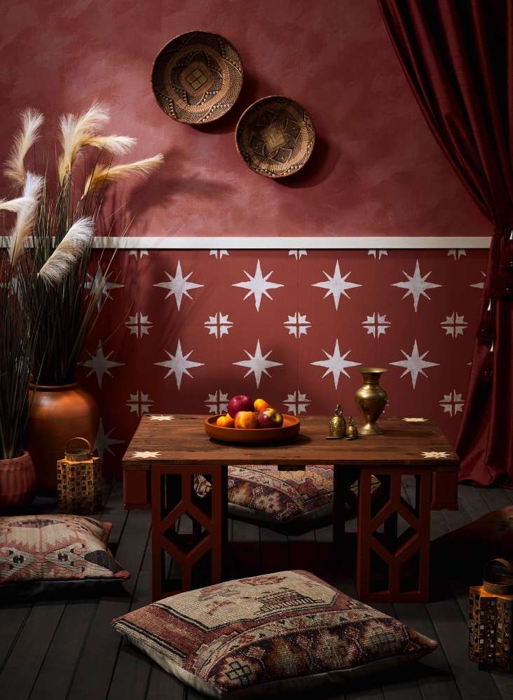
Visual texture and layers of rich colour bring warmth to this seating area perfect for any time of year. Upper wall in Resene Apple Blossom and Resene Quarter Solitaire mixed with Resene FX Paint Effects Medium, lower wall in Resene Apple Blossom with stars in Resene Solitaire, table top stained in Resene Woodsman Bark, with stencilled stars in Resene Manhattan, breeze blocks in Resene Mocha, large pots in Resene Cinnamon and Resene Mocha, lanterns in Resene FX Faux Rust Effect, deck stained in Resene Woodsman Tiri, table tray in Resene Cinnamon, candle tray in Resene Burgundy. Floor cushions from Yuva Project: Melle Van Sambeek. Photo / Bryce Carleton
Typically colours with red, orange, yellow undertones will be warmer, while colours with blue, green, and purple undertones will be cooler. Picking undertones can seem tricky but you can try your chosen colour against another version of that colour to help show up the undertones in each.
If you’re unsure - and picking undertones can be tricky - chat to a Resene colour consultant at your local Resene ColorShop.
Classic autumnal
Another popular colour scheme that can work through any season, is one that uses “sunset” shades in terracotta, peach and burnt orange.
As well as being reminiscent of autumn leaf colours, these shades can work particularly well to give a sense of warmth, even in fresh pale shades like Resene Awaken or Resene Waxflower
Try a gradient of peachy beiges from Resene Bone through to Resene Just Right, Resene Kalgoorlie Sands or, delicate pink Resene Pot Pourri through to Resene Japonica and Resene Sebedee. In their palest forms these peach-toned autumnal shades work well as a neutral base from which to add deeper, bolder shades. For added warmth, pair them with rich botanical greens in Resene Swamp or Resene Karaka and plenty of plants.