Kermit the frog Frog may have famously found it “ain’t easy being green”, but maybe it was because he was talking about that particularly vivid shade of bright, yellow-toned green.
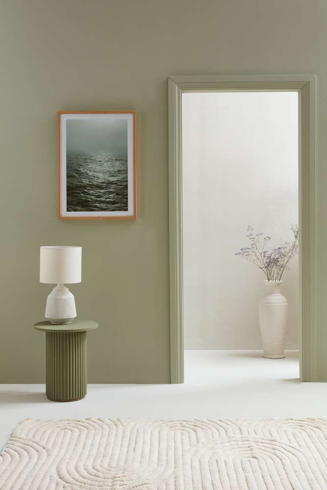
Today’s favoured greens are smooth, muted, and subtle. They are versatile enough, with greyed or beige edges like Resene Nirvana or Resene Rainee, to veer toward neutrals, while being warm and bold enough, like Resene Field Day and Resene Paddock, to add modern sophistication to any room.
These olive and sage-toned greens are an evolution from our fondness for biophilic greens, into earthier, more mossy notes that keep us connected to nature - with a little extra attitude.
Start your property search
Green goodness
Resene Colour Expert Meryl Southey says these deeper, moodier greens are popular for interiors and exteriors because they create a sense of calm and serenity. “The deeper hues like Resene Seaweed or Resene Off The Grid, create drama without being overwhelming.
“They have that direct connection to nature, laying a foundation for all other colours. That means they are naturally versatile and are easy to pair with other shades.
“Most of these greens have a greyed or muted edge to them,” Meryl says. They’re less colour saturated or bright than some other greens, which can make them work well as a neutral while adding just enough colour to be unexpected and interesting.
Mutedgreens add complexity to a minimalist aesthetic. Layer texture and graduatedshades of the colour for depth and visual interest. Rear wall, floor, lamp baseand planter painted in Bubble White, front wall and door frame in Bud and side table in Siam. Project by Amber Armitage, image by WendyFenwick.
For a layered neutral effect based on muted greens, try a background wall colour in Eighth Lemon Grass with off-white trim in Merino. Add layers of deeper complex greens in Lemon Grass, Double Lemon Grass and darker Camouflage as an accent. FX Metallic Gold on a light fitting or picture frames also adds elegance and polish.
There are also several shades within the Whites and Neutrals range that have quite a muted but noticeable green hue that can work well as the foundation of a sophisticated green palette. Try shades like Secrets, Kangaroo and Ash, layered with Flax, Paddock, Rivergum and Forest Green, which will bring out the base green tones in your neutral.
These neutrals also provide a good balance for other bold shades such as dark blue Avalanche, dark red Persian Red and khaki Kokoda.
While you’re thinking about neutrals, a rich olive or smoked green can make an interesting alternative to black. Try deep Log Cabin or subtly bronzed Turtle Green for a finish that offers a little more visual surprise than standard black. Double down on the impact by adding a complex but bold accent like Pirate Gold or Red Berry. Alternatively, add some subtle freshness with a muted pink like Soothe.
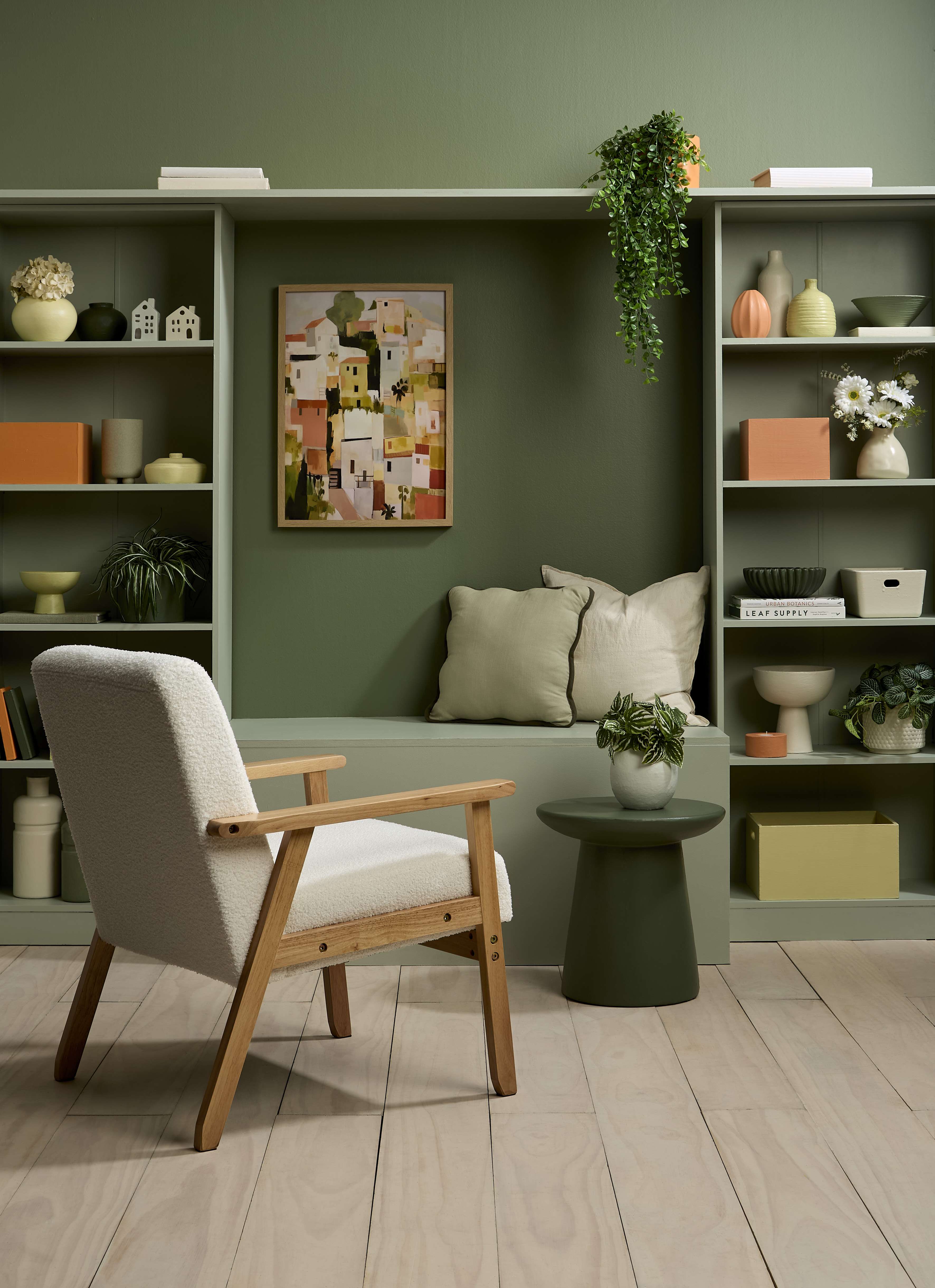
Dustedand parched tones of terracotta and fresh yellow add complexity and drama tolayers of muted and complex greens. Wall painted in Paddock, floor staincolour washed in Colorwood Breathe Easy, bench seat and shelves in Green Spring, side table in Cabbage Pont, top plant pot in Sunrise, books in Secrets and Spanish White and planter on tablein Secrets. Vases, bowls, boxes and accessories on shelf in LemonTwist, Cabbage Pont, Secrets, Spanish White, Sunrise, Lemon Twist, Iko Iko, Japonica and Paddock.Chair, footed candle and green cushion from Kmart, cream cushion from TheWarehouse, artwork from Serola Art Studio/Etsy. Project by Vanessa Nouwens, imageby Bryce Carleton.
For a luxurious suede-like finish use these deep greens on walls in a matte or low sheen finish such as SpaceCote Low Sheen or SpaceCote Flat.
Within the idea of these versatile and sophisticated greens, there are still plenty of different hues to play with and plenty of other colours that will work well in your overall palette, Meryl adds.
For example, try the delicate tranquillity of Eau De Nil layered with the fresher leafiness of Norway and the rich lushness of Palm Leaf. Finish with a pop of heady tropical yellow Bird Flower for an uplifting retreat space you can immerse yourself in.
Olive greens like Contour work well with the burnt lime tones of Saratoga, and green-edged whites like Travertine. This time, try a contrast accent in the sun-baked earth tones of Wild West.
Meryl also suggests trying murkier, primordial greens such as Raptor with herbaceous sage greens like Bud and reddish tans like Half Hairy Heath. Add a note of freshness with trim in Eighth Tea.
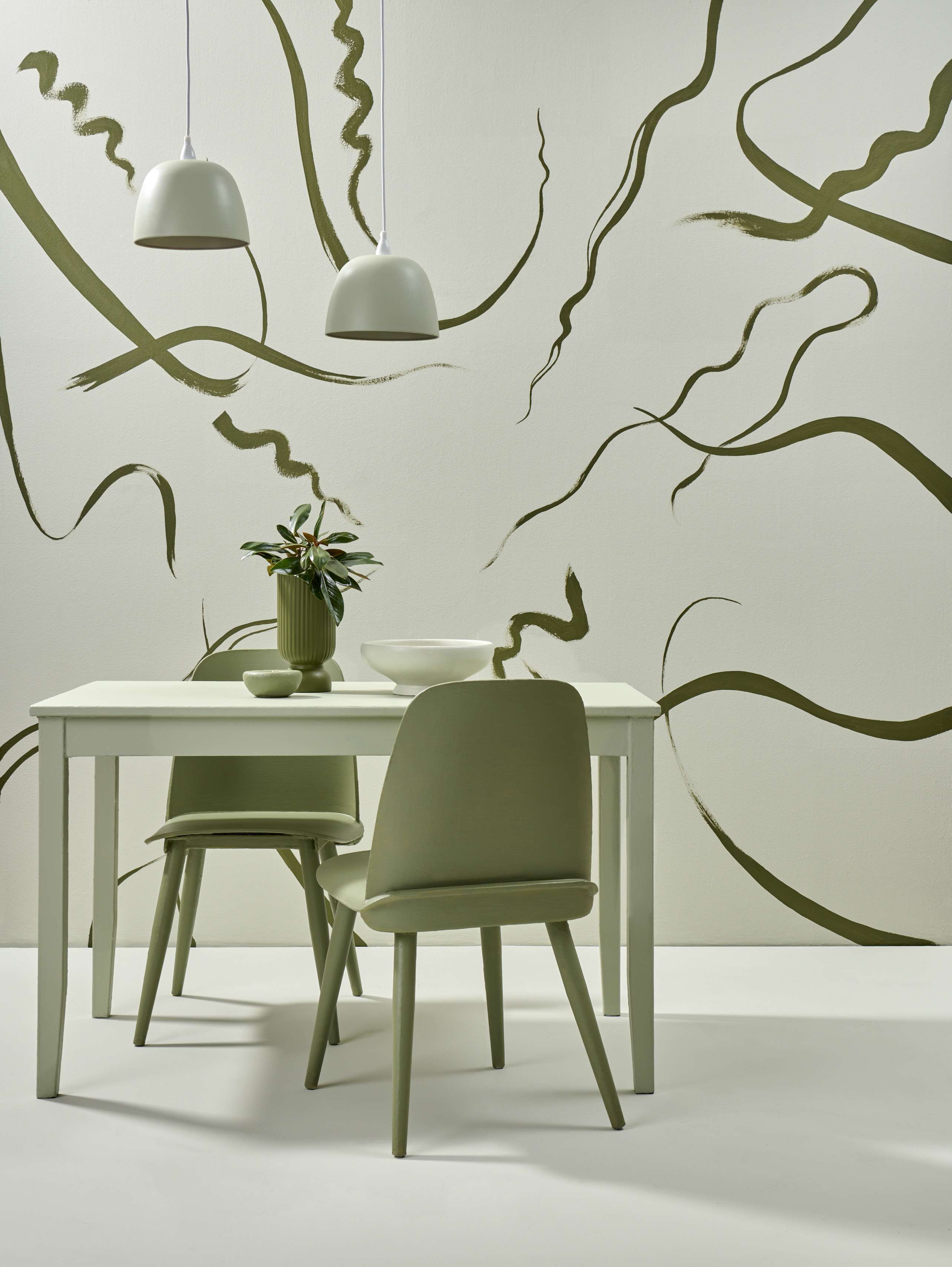
Adda contrast in rich, earthy green against breezier, fresh greens for dramaticeffect. Wall and floor painted in Moon Mist, mural and tall vase in Waiouru, chairs and tealight holder in Siam, table and pendantlights in Bud and bowl in Moon Mist. Project by Vanessa Nouwens,image by Bryce Carleton.
Cool sophistication; or warm elegance
As with any colour scheme, working with a palette based on sophisticated, muted greens will work best if you choose all cool or all warm colours. Which end of the temperature scale you choose could depend on a range of things, from your personal taste, to the aspect, light levels and natural feel of the room you are redecorating.
Cool colours in a south-facing or dark room may make a space feel cooler and less inviting, while warm colours in a sunny, light north-facing room may feel too bright and intense. Each space is different, particularly when combined with your personal taste and the vibe you want to create.
Try different shades out using Resene testpots and Resene A4 drawdown paint swatches so you can experiment before committing. Staff at your Resene ColorShop will also be able to make suggestions on what colours will work well together to create the look and feel you want based on the details of your room.
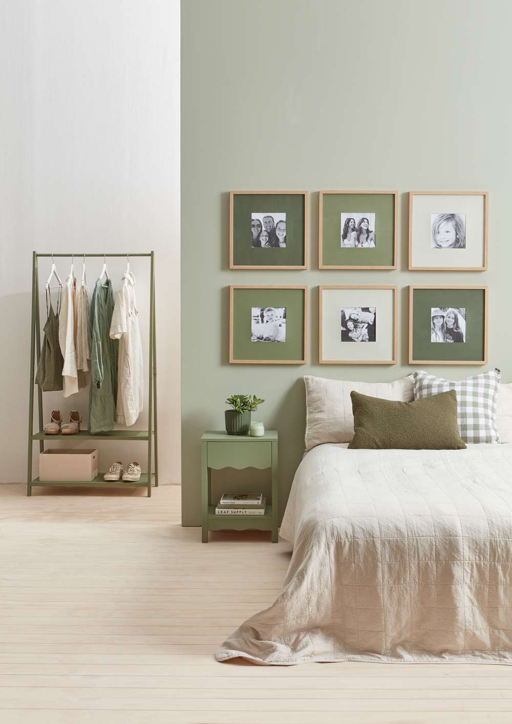
The right pared-backgreen adds just enough colour to a neutral look to give it personality andflair. Rear wall painted in Eighth Blanc, right wall in GreenSpring, floor stain colour washed in Colorwood Whitewash, clothing rackand bedside table in Paddock, small pot in Cabbage Point, storagebox in Quarter Drought and frames in Cabbage Point. Paddock and Kangaroo. Quilt and candle from Kmart, cushions from Adairs.Project by Vanessa Nouwens, image by Wendy Fenwick.
Meryl’s advice for how to spot complex greens that are cool or warm is to look for yellow or blue undertones. One simple way to do this is to place a sheet of white paper between your A4 swatches, which will mean your view of your colour samples won’t be influenced by colours around them, making it easier to see their true undertones.
Top tip: Always check your test colours in both natural and artificial lighting.
“Generally speaking, warm greens have more yellow in them, like shades of olive or chartreuse, while cool greens have more blue undertones, like peppermint and aqua,” Meryl says.
“Deeper shades of green are warmer no matter the undertone because they have less white, and greens which present a grey undertone such as sage greens are warmer because they are muted and not fresh and clean.”
Green remains one of the most versatile and timeless colours to work with. That and its natural connection to nature are why it remains hugely popular as a design choice. These smart and sophisticated greens open up a whole new range of colour combinations to give you a classic and elegant look.
If you need help finding just the right green for your decorating project, come in and visit your local Resene ColorShop, Ask a Resene Colour Expert free online, www.resene.com/colourexpert or book a Resene Colour Consultation free instore or virtually or a paid home visit in selected areas, www.resene.com/colourconsult.