When choosing neutrals or colours for an interior colour scheme, some of the most interesting and versatile looks can come from experimenting with “in-between” shades.
A simple example would be a classic black and white checkerboard floor. You can go for a quintessential pairing of Resene Black and Resene White. However, going slightly “off” those colours into charcoals, greys, chocolates and creams gives you the classic of a checkerboard floor, but with an interesting, edgier spin.
One of the most versatile ways to start experimenting outside classic neutrals and colours is in shades often described as having a “blackened edge”. Let’s look at what that means.
Start your property search
Understanding the edge
Resene colour expert Meryl Southey says colours with a blackened edge most typically refer to whites that have a hint of grey. The Whites and Neutrals range includes popular colours like Black White and Double Alabaster.
“These two whites look great teamed together for a white-on-white scheme, particularly if you add textured finishes for walls and varying sheen levels such as gloss finish Enamacryl with SpaceCote Low Sheen,” Meryl says.
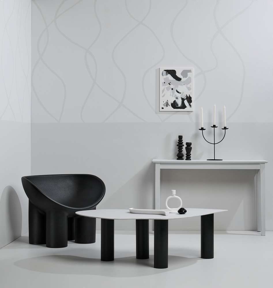
Thispared-down, minimalist look is given a crisp, cool finish by using greyed whiteneutrals and earthy darks. The upper wall is painted in Half Concrete,lower wall and squiggle lines in Concrete, floor in QuarterConcrete, hall table in Concrete, coffee table in Triple Concreteand legs in Element, vases in Soothe and Triple Concrete,DIY artwork in Concrete, Triple Concrete and Element andturned wooden candleholders in Element. Chair from David Shore, vasesand circle candleholder from H&M Home, circle vase from Kmart. Project byMelle van Sambeek. Image by Bryce Carleton.
Top tip: Two ways to add texture to your walls are by adding an undercoat of Sandtex for a plastered look, or by using a raised pattern anaglypta wallpaper like Wallpaper Collection 5019.
“Both these whites will brighten up spaces but Black White has a stronger blackened edge giving it a chalky white finish. Double Alabaster is slightly brighter because it has less tint.”
These differences mean these shades not only bring some subtle variation into a white-on-white look, it makes them versatile in how you can use them and what other colours they will work with.
“Black White is slightly cooler so it suits slightly brighter or warmer spaces and works well on harder surfaces such as stone or concrete.” Try Black White with spicy red Jalapeno or, for a more neutral finish, soft taupe Coffee Break.
“Double Alabaster is still cool enough to counteract warm northern light, but is slightly less grey so it creates a slightly warmer atmosphere. It also teams well with timber floors,” Meryl says. Try it with warmer red Pohutukawa or ochre green Colins Wicket and wood stained in Colorwood Matai.
If you want to look at how a blackened edge to your neutrals changes the feel of your space, try testpots in different strengths of Alabaster, from quarter strength through to double. All have a blackened edge of different amounts. You could also try a non-blackened white like Eighth Rice Cake to see how that might change the feel of your room.
Other blackened or greyed whites to experiment with from the range include Half Barely There, Half House White and Sea Fog.
Mid-toned neutrals with a dark edge to them can takeon an almost suede-like effect, that feels very cosy and cocooning whenfinished in a low-sheen paint like SpaceCot Low Sheen. Walls, frames andcoffee table painted in Thor, floor painted in Merino, sideboardand coaster in Sorrento, tray in Tea, planter in Thor,sideboard jugs and vases in, from left, Gargoyle and Tea
“While these whites typically have a hint of grey to them, other saturated neutrals can also have a blackened edge to them, which gives them an earthy or hazy finish,” Meryl says.
“Warm, smoky neutrals like grey-brown Kia Kaha, beige-grey Cloudy and greige Heathered Grey all have coloured undertones but also contain a hint of black which gives them a murky or dusted appearance.
“This allows the colour to retreat into the background allowing you to have the interest and impact of using a bolder colour, without overpowering your space. It also means they work well as a backdrop for stronger pops of colour as accents in your room.” Try Heathered Grey with Sanguine from the Karen Walker Range or try Cloudy with Dark Chocolate.
Top tip: Whites and neutrals with blackened edges tend to be on the cooler side of the spectrum, even browns and beiges that are blackened can appear cooler compared to cleaner, warmer neutrals.
Hit the mute
Working in these darker fringes of colours needn’t mean sticking strictly to grey-toned whites and off-whites.
One colour movement that is popular at the moment is muted shades, otherwise often described as weathered or dusty. These are typically mid-toned colours that sit somewhere between pastels and colour saturated or richer jewel tones.
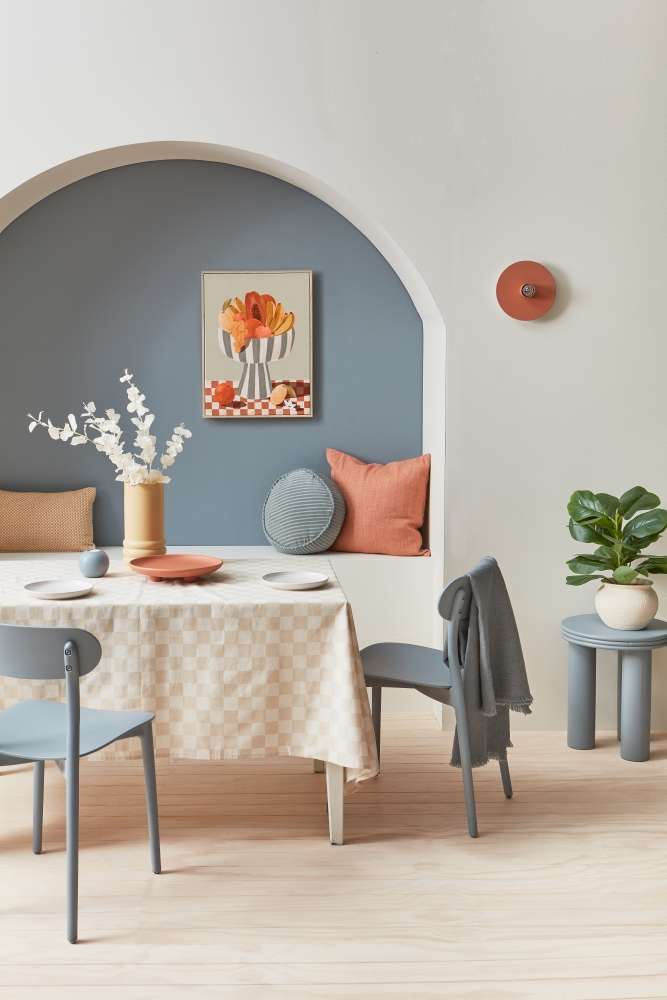
Soft muted blues work like a neutralagainst fresh whites, adding subtle colour without dominating and allow accentterracotta shades to shine. Wall and dining table in Double Rice Cake,arch wall, side table and chairs in Regent Grey, floor stain washed in Colorwood Whitewash, wall light and plate in Sante Fe, roundtealight holder in Regent Grey, tall vase in Putty. Project by VanessaNouwens. Image by Wendy Fenwick.
Some examples are soft teal Undercover, dusky pink Contented, deep gold Sunbeam. Like smoky neutrals, the softer, pared back nature of these colours means they work to subtly add colour to your rooms, without overtaking the space.
For example, if you love pink but don’t want your room to feel too sweet or childish, try walls in Blanched Pink from the Karen Walker range, layered with muted off-white Albescent White.
For a subtle sophisticated beachy look that will work all year, try popular Duck Egg Blue on walls, with wood surfaces stain washed in Colorwood and accents in smoked charcoal Blue Bayoux.
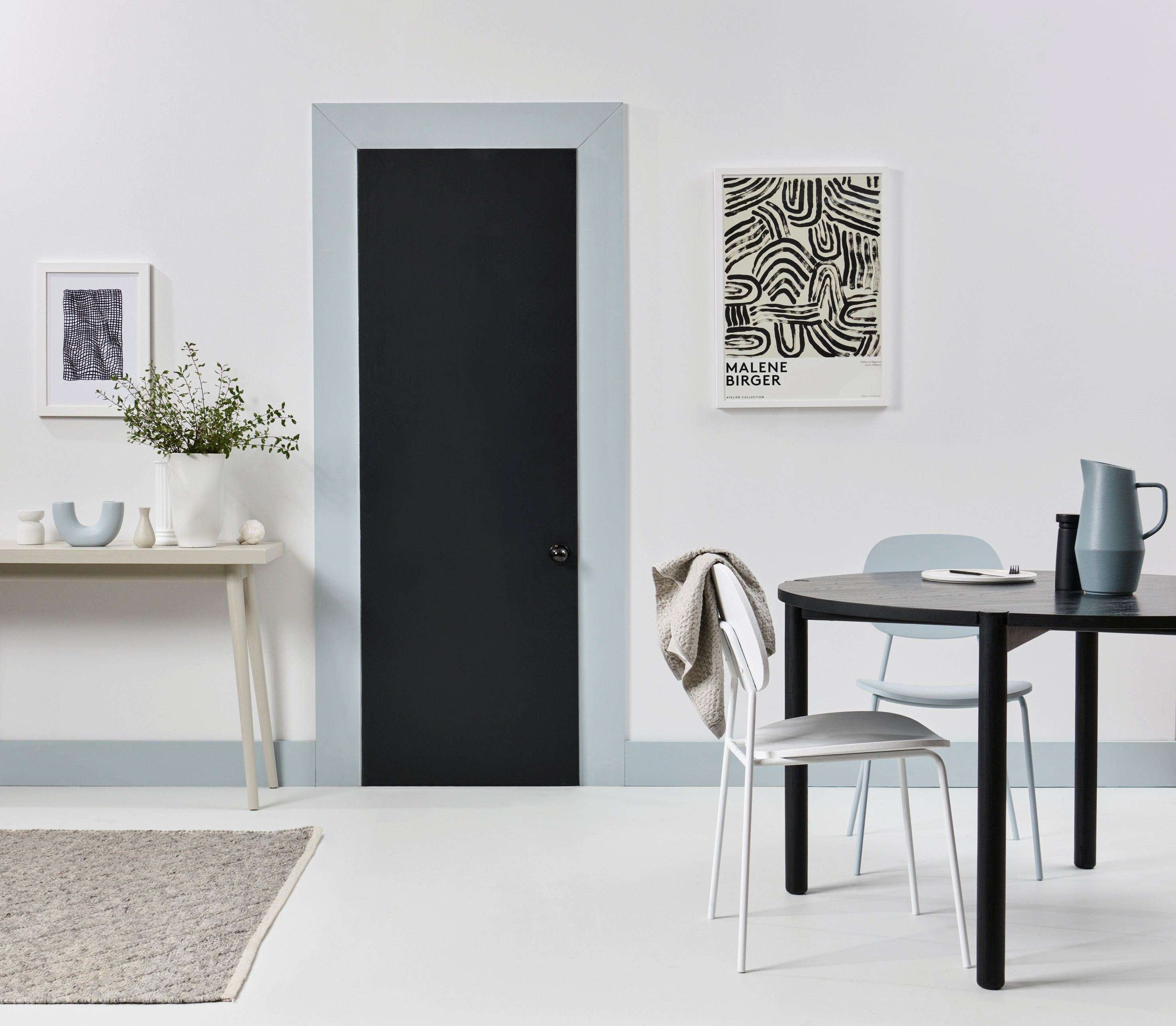
Blackenedwhites offer a crisp contrast to off-black charcoal accents, while the smokyblue softens the transition between the two in this room - literally. Wall in Quarter Sea Fog, with floor painted in Double Sea Fog, trim in Half Dusted Blue, door in Black Sand, chairs in HalfDusted Blue and Quarter Sea Fog, side table in Triple Sea Fog,with vases, from left, in Half Dusted Blue, Nomad, DoubleSea Fog, table jug in Baring Head. Dining table from Bauhaus, smallartwork ‘Hometime’ from endemic world, large artwork City Hall. Project by KateAlexander. Image by Bryce Carleton.
If you have a strong colour in your room, perhaps in a feature armchair or couch, a tonally similar muted shade can be an excellent way to showcase and emphasise that piece without detracting from it. For example, if you have a luxurious velvet sofa in a rich mustard-gold similar to Hot Toddy, paint the wall, or even just a colour block, behind it in ochre cream Smoother Operator. It will work like a neutral to complement your sofa rather than competing with it.
Top tip: For emphasis the muted or softer nature of muted or blackened colours consider using a matt finish on walls. This means they’ll reflect less light emphasising their soothing effect. In some shades like Resene Double Friar Grey or Resene Half Stonewall they can even take on a suede-like appearance, perfect for a cosy bedroom.
Experimenting with muted, smoked colours and neutrals with a blackened edge can open the door to a unique and visually interesting colour palette that remains timeless, versatile and elegant.
If you need help choosing the colours that best suit your home whatever the season, come in and visit your local Resene ColorShop, Ask a Resene Colour Expert free online, www.resene.com/colourexpert or book a Resene Colour Consultation free instore or virtually or a paid home visit in selected areas, www.resene.com/colourconsult.