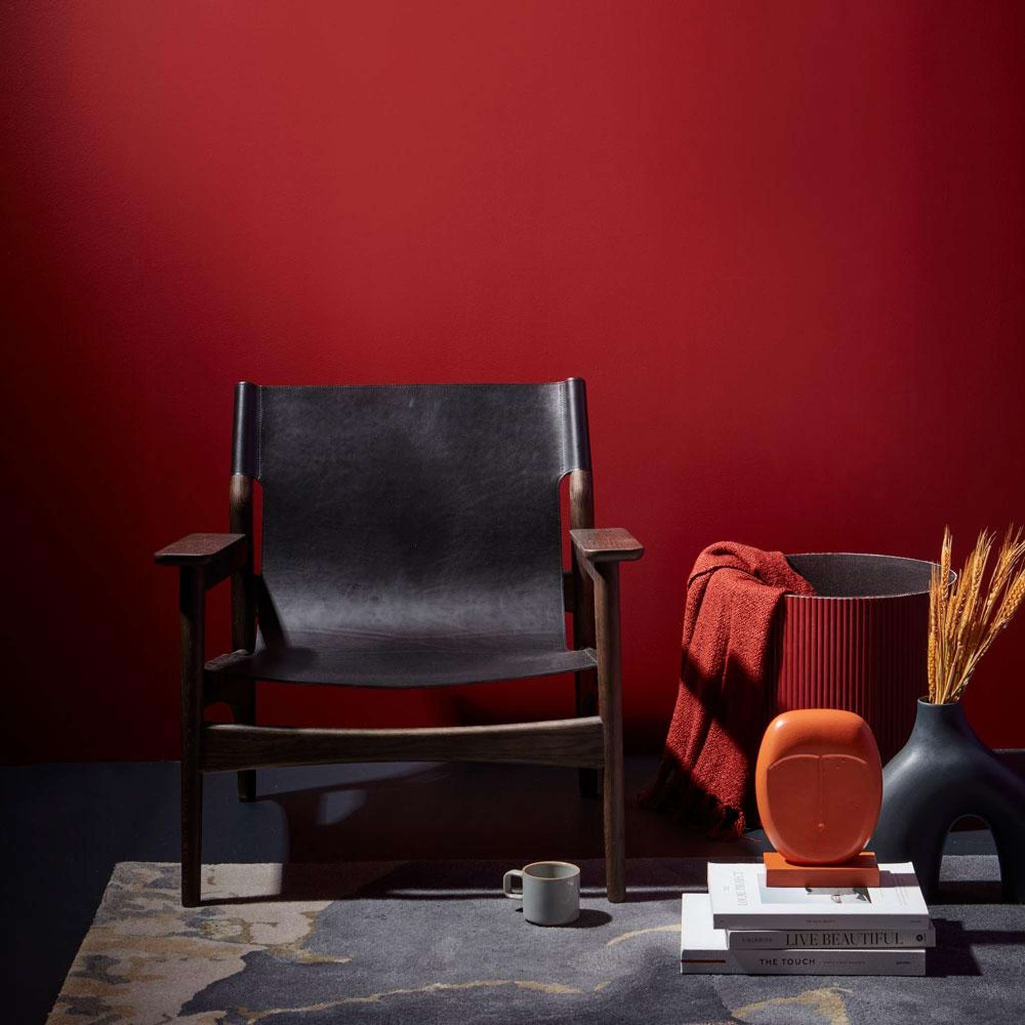
Deep wine and berry reds are replacing rustic tones in New Zealand homes.
Warmth is one of the feelings we all chase when designing rooms where we want to relax, gather and unwind, whether that is a bedroom, a dining room or a cosy sitting room.
For a long time, that warmth was delivered by rustic, brick-toned reds such as Resene Red Oxide and Fahrenheit – loved for their earthy, homestead feel. More recently, however, that classic red has been steadily deepening, moving away from those comforting rustic roots and into richer, more saturated wine and berry territory, with rich burgundies, plums and even moody red-toned purples increasingly finding favour.
Adjusting your palette palate
Start your property search
Feature walls are a popular place to use reds in interiors with many home decorators, wary of overwhelming their rooms, opting to create a focal point rather than colour drenching these spaces. These ‘new’ reds also reinforce our love of classic off-white neutrals, pairing well with hues such as Resene Spanish White.
Now there’s a move toward shades with a different depth and complexity.
From the 2016 Resene Multi Finish range, colours like the deep plum of Resene Rustic Red, the classic burgundy of Merlot, the mid-toned Vanquish and the moodier, almost garnet Cab Sav, illustrate how broad the wine-red spectrum has become. Each carries a slightly different undertone, and making the right choice to suit a room's natural light is important, so that your chosen red sings. South-facing or naturally cooler rooms tend to suit warmer-toned reds, while naturally warm rooms can carry a cooler-toned red without feeling overheated.
Top tip: If you’re unsure of the undertone of your favourite Resene red, talk to the staff at your local Resene ColorShop.
Resene colour consultant Meryl Southey says that while red might feel like a daring colour at first, paired thoughtfully within a considered palette, it can bring exactly the right amount of drama to a room. That sense of drama is precisely why wine reds have grown so popular, as the colour world has shifted away from flat, one-note rusts towards shades with more nuance and depth.
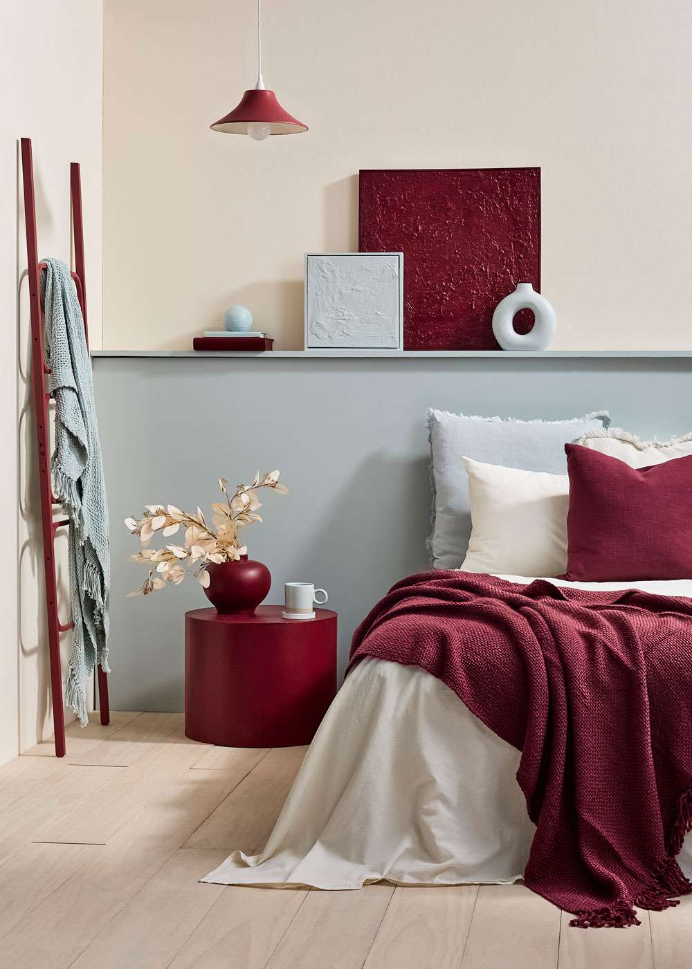
Berry reds paired with dusted blues is an increasingly popular way to bring warm contrast into rooms. Upper and side walls in Resene Half Solitaire, lower wall in Tiara, floor in Resene Colorwood Breathe Easy, bedside table, large case and large artwork in Persian Red, ladder and light shade in Merlot, books in Persian Red and Conch, ball decor and small artwork in Resene Conch, coaster and vase in Tiara. Project Vanessa Nouwens. Image Bryce Carleton.
The rooms where reds shine
Wine and berry reds often suit quieter, slower rooms: bedrooms, dining rooms and sitting rooms all benefit from the cocooning warmth these colours bring. They do not need to be used across an entire room to have impact either. That single feature wall is a good place to test your appetite for rich reds. A door, joinery, or even a piece of furniture, painted in a deep wine shade can deliver real visual weight without overwhelming the space.
For those ready to commit more fully, colour drenching an entire room, particularly a guest bedroom, powder room or media room, creates a deliberate surprise against an otherwise neutral home. Try the soft, muted red of Resene Mulberry for your drenching, and, if you need it, freshen with notes of Dutch White and a fun touch of spiced green Pacifica.
To keep that drenched room feeling connected to the rest of the house, repeat a touch of the same red elsewhere; a stool, bookshelf or wardrobe door. Floors and ceilings are an underused option too. A two-tone checkerboard floor, achieved with Resene Walk-On tinted to a rich pinot-like red such as Pohutukawa alongside a soft greyed white like White Pointer, creates a striking modern take on a traditional pattern.
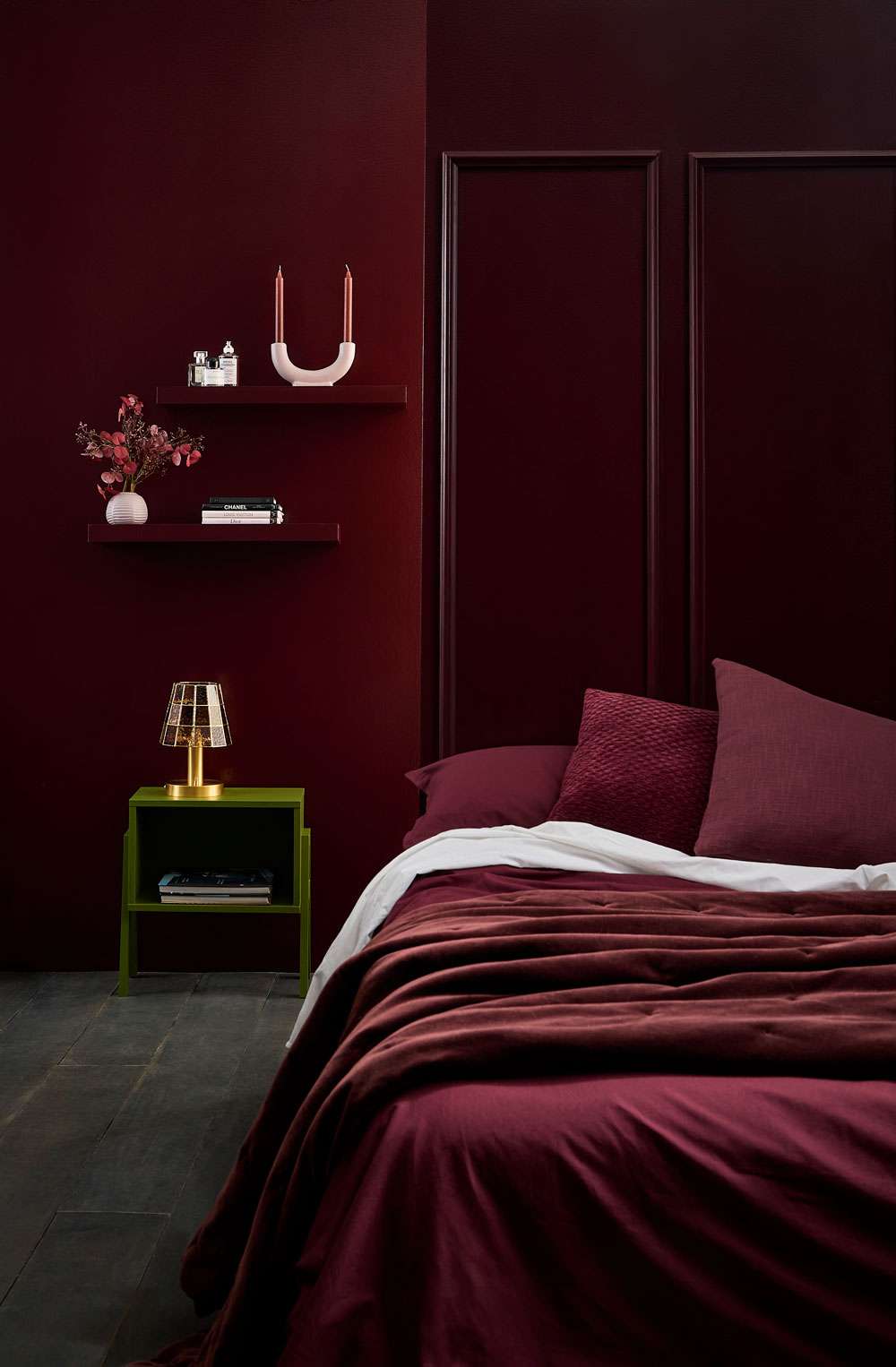
Sheen levels will impact how your deep reds reflect light, so can be a useful tool in adding visual interest and preventing a room feeling too dark. Walls in Resene Lustacryl Semi Gloss in Spitfire, floor in Resene Colorwood Shade, table in Saratoga, shelves in Spitfire, candle holder and vase in Resene High Tea. Bed linen and flowers from Bed, Bath & Beyond, lamp from Frangere. Project Melle van Sambeek. Image Bryce Carleton.
Matching your wine reds
The most reliable pairing for wine reds remains a warm, soft neutral, says Meryl. “Shades like Half Tea, Biscotti and Double Merino, Quarter Fossil and Eighth Bison Hide, stop a rich burgundy from feeling overly formal.”
When it comes to choosing the right neutral for your favourite regal red, Meryl advises paying close attention to the light levels – natural and artificial – in your room. Most deeper, saturated reds will absorb light rather than reflect it. That means if you paint a whole room that doesn’t get a lot of light, in a deep saturated red it can tip from cosy and rich into dark and a bit oppressive.
There are two ways around that:
1. Soften the colour itself. Rather than full strength, use a half, quarter or eighth tint of the same shade. Instead of full strength Merlot on every wall in a dim room, you might use Half Merlot or Quarter Merlot, which keeps that wine red character but reflects more light and feels less heavy.
Top tip: Resene testpots are helpful for this. To confirm which shades and strengths are going to work best for you, paint them on large A3 or A2 sheets, leaving a white border, and try them on different parts of the wall at different times of the day.
2. Keep the colour full strength, but use less of it. Save the most intense version of the shade for a smaller, contained area, like a single feature wall, a run of cabinetry, or joinery, rather than coating every surface. This way you still get all the drama and depth of the deep colour, but it's not absorbing light across the whole room. For example, full strength Resene Aroha or Upstage would work beautifully on a feature wall or a painted cabinet in a darker room.
It’s also worth remembering there might be some spaces where you don’t mind embracing the dark nature that may come with enclosed spaces in deep reds – a stand-alone guest toilet for example. Adding a mirror, a glass light fitting and a white basin to bounce a little light around walls painted in Resene Cab Sav could be dramatic and fun.
Sheen level also plays an important role in how your deep purple-hued reds look and feel. A velvety low sheen or flat finish, such as Resene SpaceCote Low Sheen or Resene SpaceCote Flat, enhances the richness and gives these colours a suede-like quality, while higher gloss levels intensify the colour, and reflect a little more light.
For something less expected, Meryl notes that one of the strongest emerging trends is pairing rich reds with dusty blues and muted greens, a combination that softens the formality of a deep red while keeping it current.
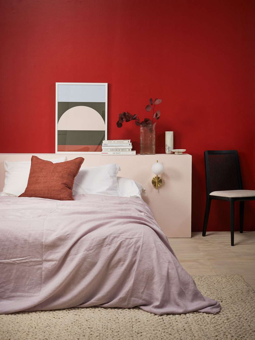
Fresh, complex neutrals help lighten your deep reds and create airiness without sacrificing cosiness. Back wall in Resene Aroha, bedhead in Inspire, floor in Resene Colorwood Breathe Easy. Books and artwork from Father Rabbit, bedside sconces from Kmart, bedding from Foxtrot Home, cushion and rug from Baya, chair from Danske Møbler. Project Amber Armitage. Image Wendy Fenwick.
A statement burgundy alongside a soft duck egg blue, a smoky aubergine against a pale grey-green, or an earthy plum-brown layered with a dusted blue and a touch of merino, all bring unexpected freshness to what might otherwise read as a heavy palette. Some combinations she suggests from the Resene colour collection include:
● Aroha and Duck Egg Blue
● Staccato and Sea Fog
● Upstage with Paddock and Half Tea
● Toledo and Norway with Quarter Fossil
● Hukanui with Dusted Blue and Quarter Merino
“Resene Aroha is a gorgeous statement burgundy. Hukanui, from the Resene Heritage Range, is a softer, muddier burgundy that is very current. Upstage a deep luxurious plum with enough warmth to feel inviting rather than gothic. Staccato is a beautiful smoky aubergine that's very contemporary and Toledo an earthy plum-brown for a cosy interior.”