Green is having a quieter, yet more confident moment in our interiors. Instead of bold, attention-seeking shades, the simple charm of leafy tones, the shift is towards deeper, more nuanced greens that feel grounded and timeless.
Think dense, earthy greens from the untouched part of the forest, or mossy layers and softened olive hues in shades like Resene Kelp, Woodland and Wilderness. These are greens that bring a sense of calm and obvious connection to the natural world. They are greens that can shape the mood of a room, adding depth, with warmth and a subtle richness that works beautifully across both modern and classic interiors.
It’s tempting to describe this palette simply as nature-inspired, but its appeal goes further than that. These greens draw on a mix of influences, from the heritage richness of Victorian and Edwardian interiors to the tailored sophistication of mid-century design and work well as an update to the relaxed, tonal palettes seen in Scandi and Japandi style.
Explore the green spectrum
Start your property search
When working with these complex greens, it helps to think in terms of a tonal family rather than a single colour choice. As Resene colour consultant Meryl Southey explains: “Deep tones like Resene Karaka, Forest Green, Waiouru and Swamp create that layered, nature-led mood. Mid-toned shades such as Rivergum and Raptor bridge the gap between softer botanical greens like Flax and Bandicoot.”
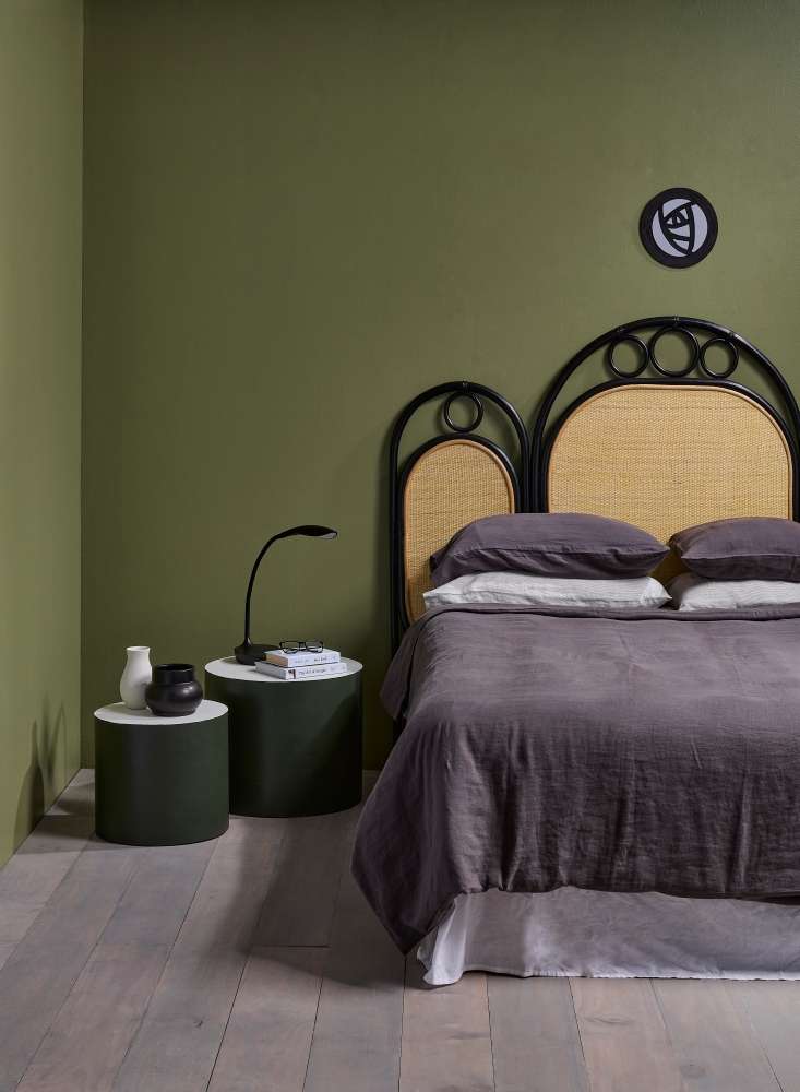
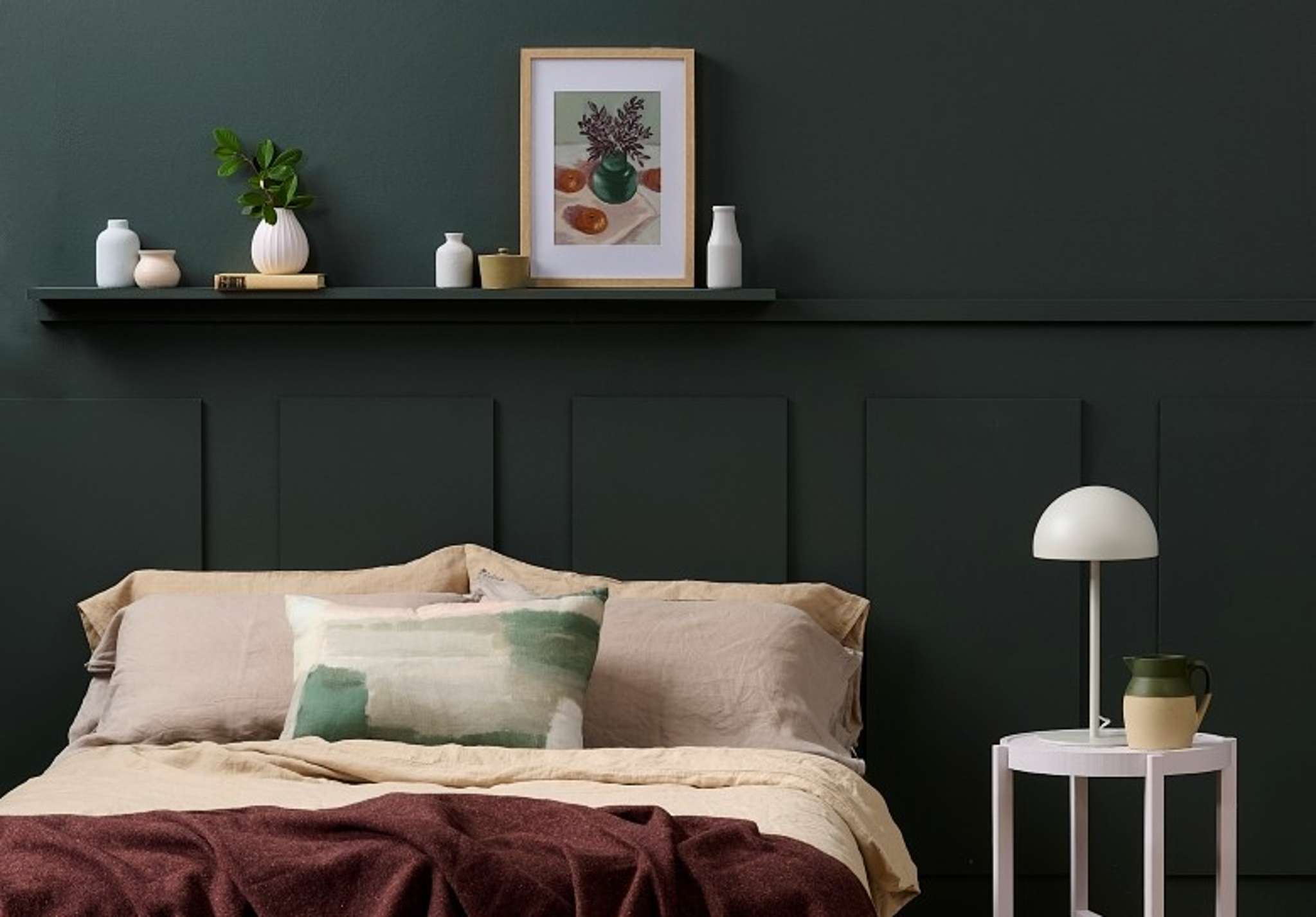
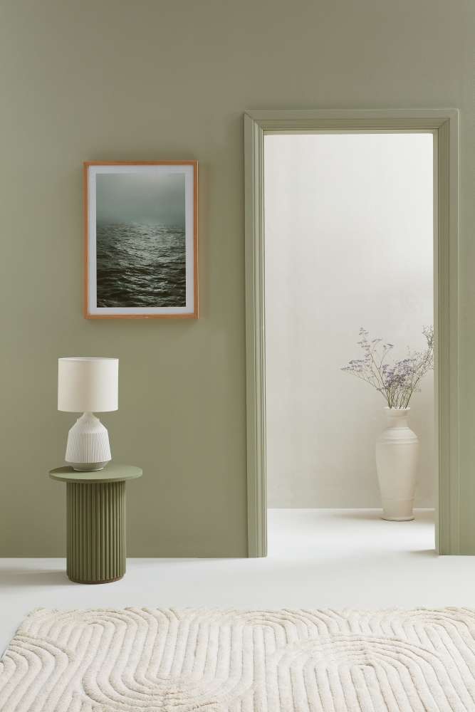
Mid-toned muted greens in a low-sheen finish give walls acocooning, suede-like effect perfect for bedrooms. Walls in Resene Finch, floorin Resene Colorwood Mid Greywash, tables in Black Forest and Green White,mirror in Resene Nero, vases in green white, pit inNero. Headboard from The Cane Collective, bedding from Città, lamp from Lighting Direct. Project Laura LynnJohnston. Photo / Bryce Carleton.
This layered approach is key. Instead of relying on one strong colour, you’re building a palette that moves from light to dark, allowing the space to feel cohesive and considered rather than flat or overly intense.
For those drawn to greens often described as olive-toned or earthier, shades like Resene Lichen, or Go Ben offer a slightly muddier, more complex base. These colours have a softness that makes them incredibly versatile and easy to live with, particularly in spaces where you want warmth without heaviness.
You can find moodier, beige greens among neutrals as well, which often look sophisticated and stylish when layered together. Try shades like Resene Triple Fossil, with Green White, and Travertine.
Why now?
Beyond their connection to nature, darker greens tap into a broader shift towards interiors that feel more personal and less trend-driven. They offer a sense of permanence and maturity, a move away from stark minimalism towards spaces that feel lived-in and layered.
There’s also a psychological aspect. Greens sit at the centre of the colour spectrum, making them inherently balanced and easy on the eye. Deeper greens, in particular, have a cocooning quality that makes a room feel secure and comforting, something many people are prioritising as homes become multi-functional spaces for work, rest and socialising.
From a design perspective, these tones also echo a renewed interest in heritage detailing, richer materials and more expressive use of colour. They pair beautifully with timber, stone and metal finishes, making them ideal for both renovation projects and new builds seeking a sense of depth.
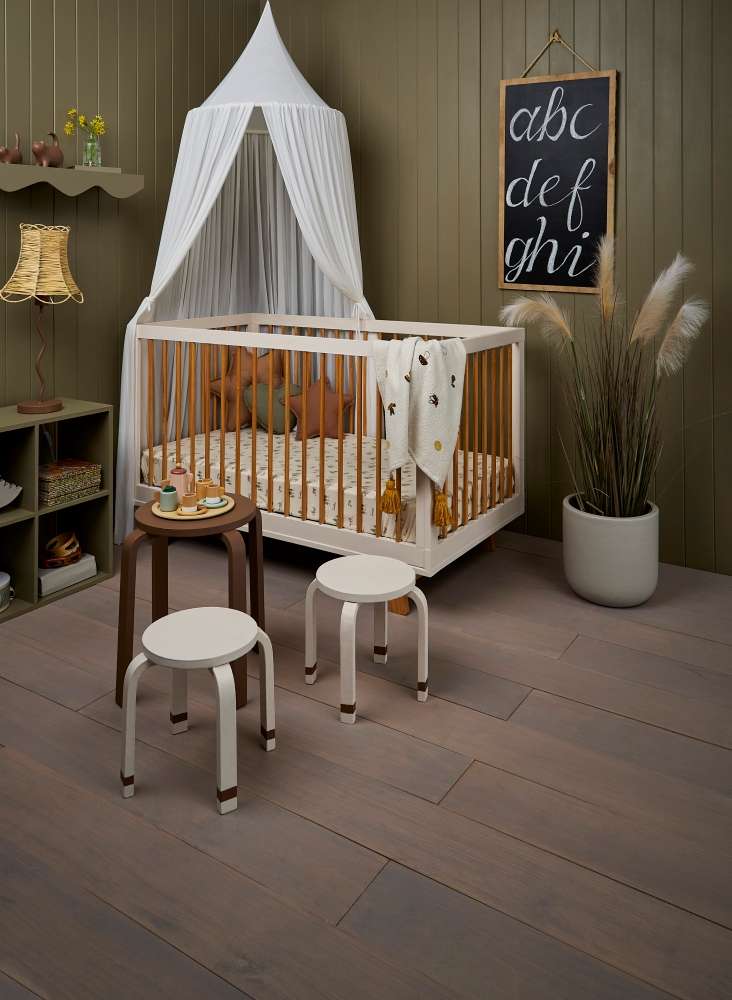
Olive and muted greens bring a connection to nature as well as a feeling of calm. Walls and shelves in Resene Lichen, floor stained in Resene Colorwood Bleached Riverstone, table and lamp base in Resene Spice, stools in Blanc and Spice, cot in Blanc, planter in Double Truffle. Blackboard in Resene FX Chalkboard. Cot, canopy, sheet, cushion, throw and tea set from Little Whimsy. Project Melle van Sambeek. Photo / Bryce Carleton
How to use darker greens successfully
The most effective way to work with these colours is through layering. Rather than painting every surface in a single deep tone, combine multiple shades to create contrast and balance.
“Layering greens with varying depths is the best way to create a moody botanical sanctuary. The deep greens pull the walls in to create a cocoon and make furniture and art pop, combined with softer shades they prevent the room feeling too heavy and provide breathing space,” Meryl says.
In practical terms, this might mean using a deep shade like Resene Quarter Karaka or Log Cabin on a feature wall or in a snug space such as a media room or bedroom. Pair this with mid tones like Castlerock on adjacent walls or cabinetry, and lighter botanical greens such as Terrain in soft furnishings or accents.
Finish also plays an important role. A low-sheen finish like Resene SpaceCote helps deepen colour and reduce glare on walls giving them an almost suede-like finish and enhancing that cocooning effect. For trims, doors or cabinetry, Resene Lustacryl in a semi-gloss finish can add subtle contrast and highlight architectural details.
Unexpected colour combinations
While green and white make for a classic combination, there’s plenty of scope to push beyond the expected.
Warm neutrals such as Resene Quarter Tea, Rice Cake or Biscotti work beautifully alongside deeper greens, softening their intensity and adding warmth. These combinations feel more relaxed and liveable than stark white pairings.
For a more elevated look, consider pairing greens with rich, complementary tones. Deep greens sit opposite reds on the colour wheel, so accents of muted terracotta, rust or even a soft blush can create a sophisticated contrast. Think Resene Tuscany or Wafer used as accent notes in textiles or accessories.
Blues can also work, particularly when they are greyed or muted. A combination of deep blue Resene Tangaroa with the burnt lime of Saratoga, for example, adds layers of depth in a colour scheme that feels cohesive rather than contrasting. Break up the look with an off-white like Carrara for a note of airiness.
Metallics are another useful tool that can create high impact with deep greens. “To truly anchor and uplift this palette introduce texture - deeper greens in velvet, softer greens in linen for example; and add metals such as brass and gold to bounce light or keep architectural details in a soft warm white or neutral,” Meryl says. Try Bullion or Gold from the Resene FX Metallics Range.
Muted,moody greensneed not mean going dark. With neutrals they add complexity and visual interestto a minimalist aesthetic. Rear wall, floor, lamp base and planter painted inResene Bubble White, front wall and door frame in Resene Bud, side table inResene Siam. Project Amber Armitage. Photo/ Wendy Fenwick.
Olive and smoky greens can also work well to bring warmth and understated luxury to popular, minimalist Scandi, or Japandi interiors. Start with a neutral base in off-whites or barely-there greens like Half Copyrite or Quarter Tea, balanced with wood grains stained in Resene Colorwood Rock Salt or deeper Matai. Then layer in a mid-tone like Resene Eagle with deeper accents in Hemlock and Scrub.
Getting the most from these colours
Lighting is important when working with darker greens. These shades can shift dramatically depending on natural and artificial light, so always test with Resene testpots and observe throughout the day.
In lower-light spaces, balance is essential. Pair deeper greens with lighter tones on ceilings or adjacent walls to prevent the room from feeling closed in. Conversely, in well-lit rooms, you can be more confident using darker shades across larger areas.
Texture should never be an afterthought. These colours come to life when paired with tactile materials, timber, wool, linen, leather or stone. This not only adds visual interest but also enhances the sense of warmth and comfort.
Finally, consider scale. Darker greens are incredibly effective in smaller, more intimate spaces where their cocooning qualities can be fully appreciated. In larger rooms, use them more strategically to define zones or highlight architectural features.
A palette with staying power
What makes these deeper, more complex greens so appealing is their versatility. They can be bold or subtle, traditional or contemporary, depending on how you use them. More importantly, they have a sense of longevity that transcends short-lived trends.
By working with a layered palette, thoughtful pairings and a mix of finishes and textures, you can create an interior that feels rich, inviting and deeply personal. Whether you lean towards the drama of forest greens or the softness of earthier, olive-toned shades, this is a direction that offers both creativity and comfort in equal measure.