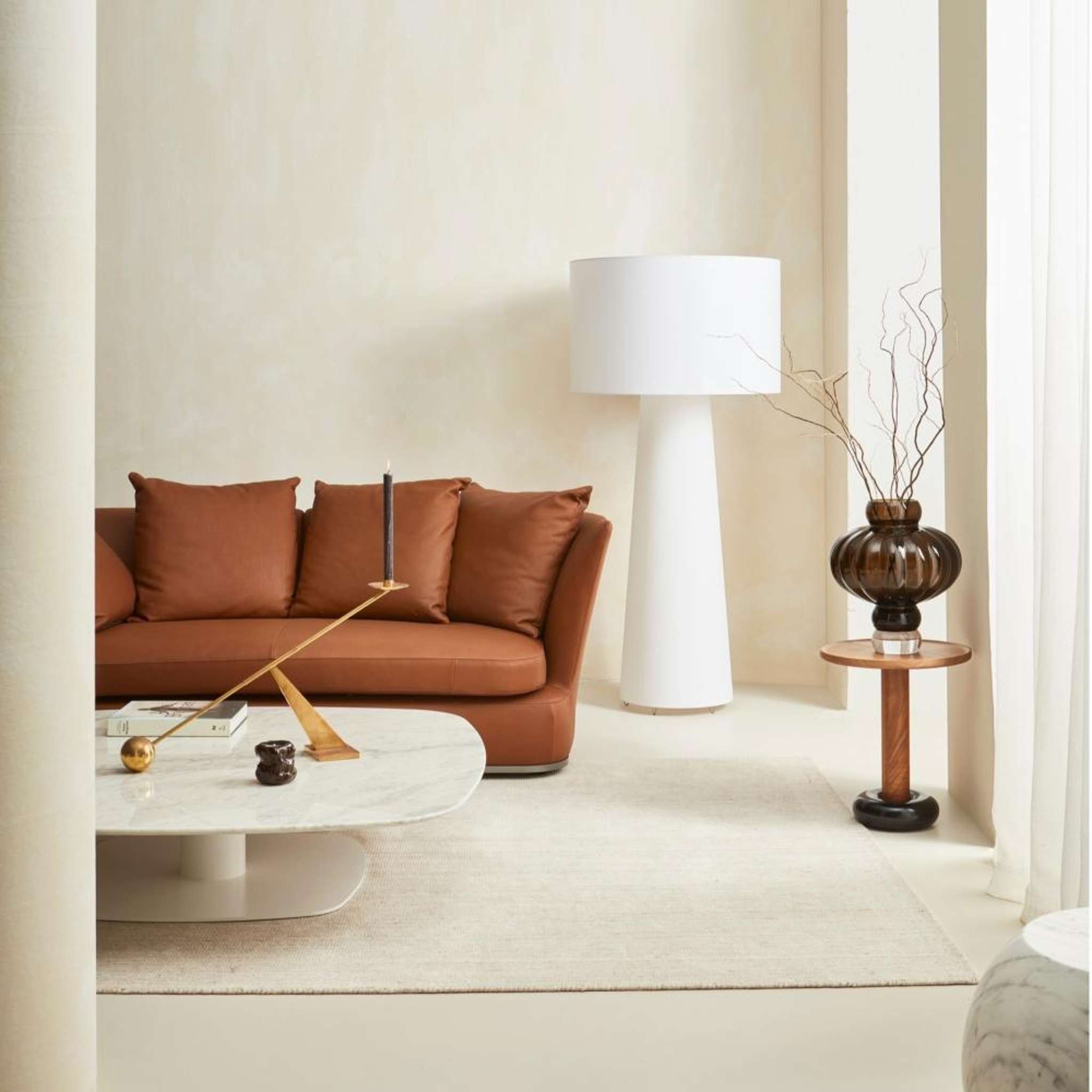
Walls in Resene Tea with Resene FX Paint Effects tinted to Quarter Tea applied over the top, floor on Resene Walk-on in Tea. Sofa, table and lamp from Matisse, side table from Tim Webber, vase from Slow Store. Project by Amber Armitage, image by Wendy Fenwick.
Fresh, timeless, endlessly versatile. White remains one of the most popular choices for interiors. But with so many beautiful Resene whites to choose from, there are a few things to think about when choosing the right one.
White has that wonderful ability to make a room feel open. It provides a blank canvas for furniture, artwork and your most loved possessions, not to mention allowing architectural details and natural materials to shine.
Start your property search
Not all whites are created equal though, and their subtle undertones can completely change the look and feel of a room.
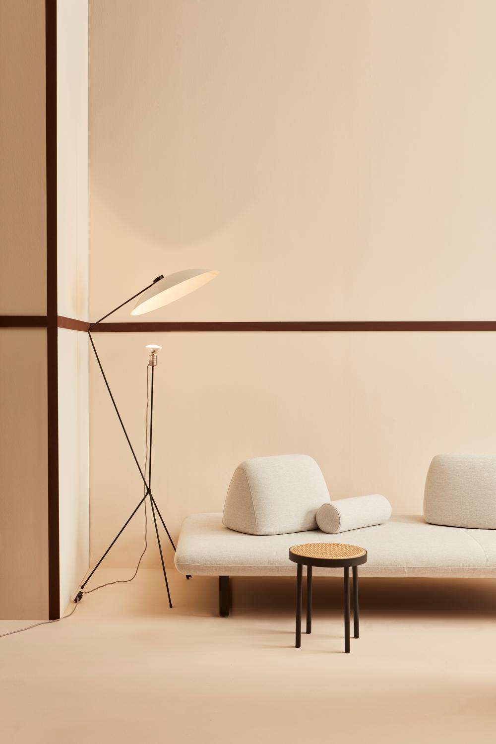
Walls in Resene Half Scotch Mist, trims in Brown Pod, floor in Half Sour Dough. Seat and lamp from Ligne Roset. Design by Amber Armitage, image by Wendy Fenwick.
Warm or cool?
Warm whites, such as Resene Rice Cake, Half Spanish White and Eighth Pearl Lusta, have subtle hints of yellow that create a welcoming, comfortable atmosphere.
These shades work well in rooms that receive less sunlight and help to soften cooler light. They're also ideal for traditional homes, relaxed living spaces and interiors with timber and earthy textures.
Cool whites, including Black White, Alabaster and Sea Fog, have grey or blue undertones that create that fresh, clean aesthetic. Working beautifully in sun-filled, north-facing rooms, they balance bright natural light while giving contemporary interiors a crisp, sophisticated finish.
Lighting plays a significant role in how white appears too. Always test your chosen whites in the room or house with Resene testpots before committing. Observe them throughout the day as well as under artificial light in the evening, as even the slightest undertone can become more noticeable.
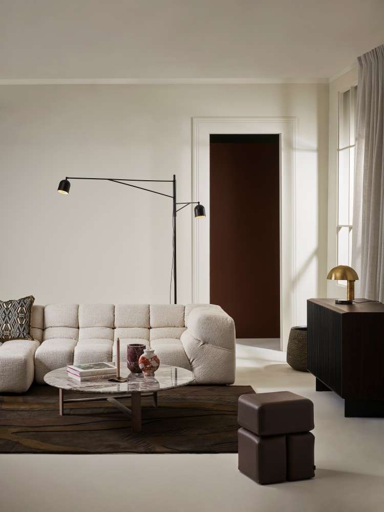
Walls in Resene Thorndon Cream, ceiling in Half Thorndon Cream, floor in Resene Walk-on in Half Truffle, through doorway in Milk Chocolate. Sofa, coffee table, ottoman and floor lamp from Matisse, buffet from Bradfords, lamp and vases from Obery. Design by Amber Armitage, image by Melanie Jenkins.
Layer upon layer
To stop your white interior from feeling too stark or clinical, layer different strengths to create depth and visual interest that won’t compromise that lovely sense of openness.
For example, pair your walls in Merino with lighter trims or ceilings in Quarter Merino for a subtle tonal effect. Alternatively, introduce a slightly deeper neutral on cabinetry, doors or architectural features to create gentle contrast.
Texture is equally important when it comes to white tonal schemes. Linen curtains, boucle upholstery, woven rugs, tactile ceramics, all add softness and dimension.
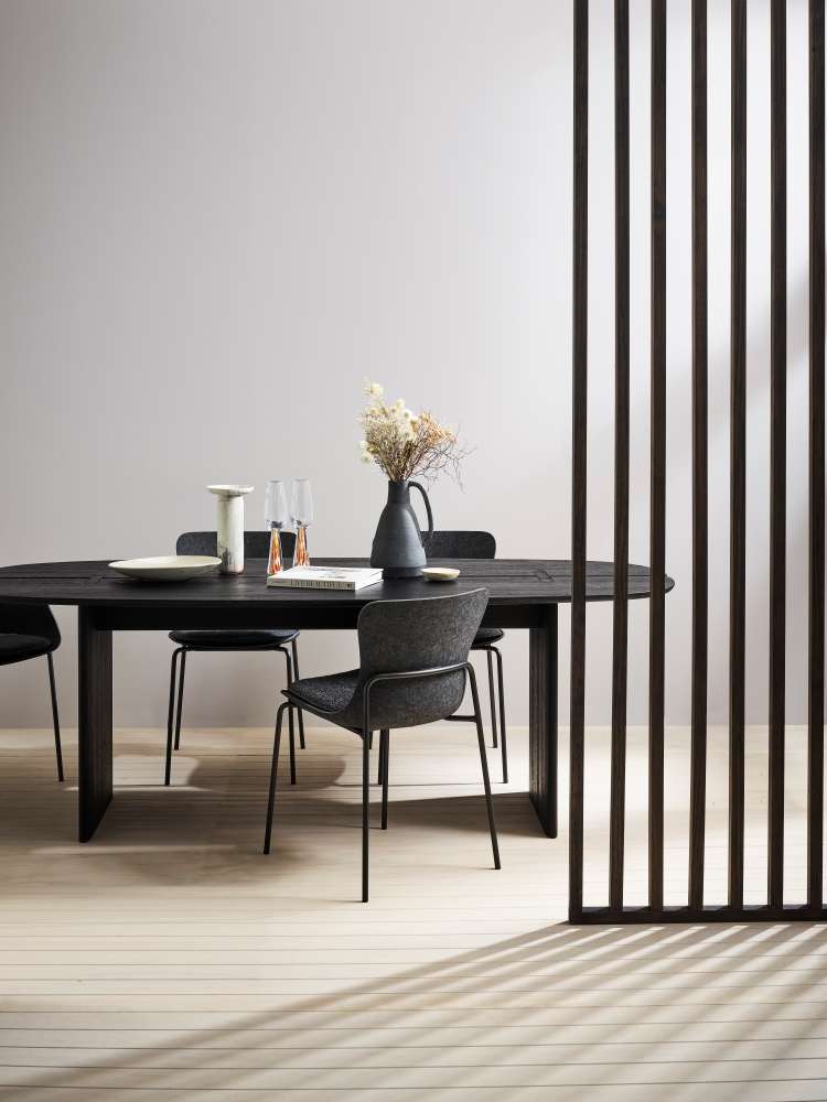
Walls in Resene Sea Fog, floor in Resene Colorwood Breathe Easy and timber feature in Colorwood Tiri. Table and chairs from Ligne Roset. Design by Amber Armitage, image by Wendy Fenwick.
A match made at home
Few combinations are as timeless as white and timber. Wood brings warmth and character to light interiors and can ground an otherwise monochrome space.
For a light, coastal aesthetic, pair warm whites with stains like Resene Colorwood Whitewash or Bask. Or, for something more dramatic, deeper stains such as Walnut or Deep Oak introduce a rich sophisticated edge.
White also provides the perfect backdrop for introducing colour. Soft sage greens, breezy blues and terracottas – Pumice, Oxygen or Sante Fe – complement warmer whites beautifully, while charcoal, navy and deep forest greens can create striking accents for cooler shades.
The beauty of white lies in its versatility. With the right undertones, textures and complementary colours, a white interior can feel anything but ordinary.