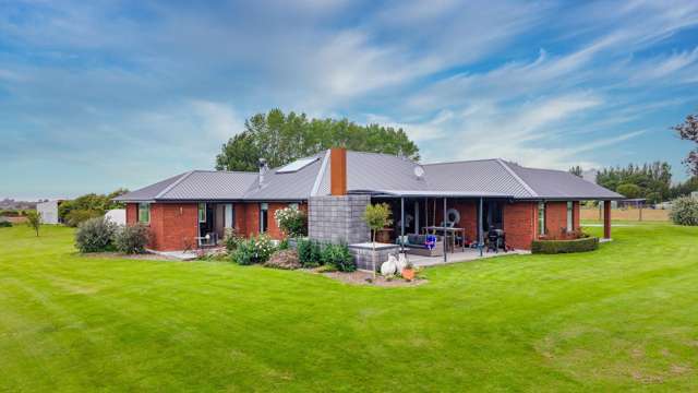
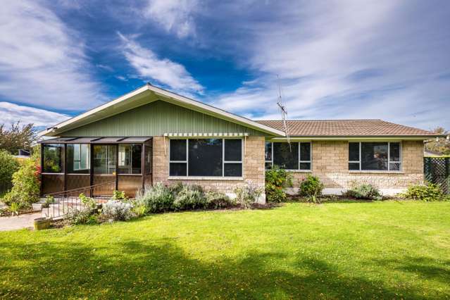
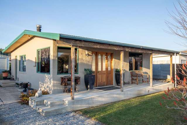
When you’re planning a home makeover project, no matter how big or small, it’s important to have a clear idea of what you want to achieve.
For many people, that includes being clear about whether they are making over their home to suit their own lifestyle and taste or whether they are improving things to make their home more appealing and valuable to potential buyers. You may not be selling right now - but you might have a clear plan to be selling the house in the future.
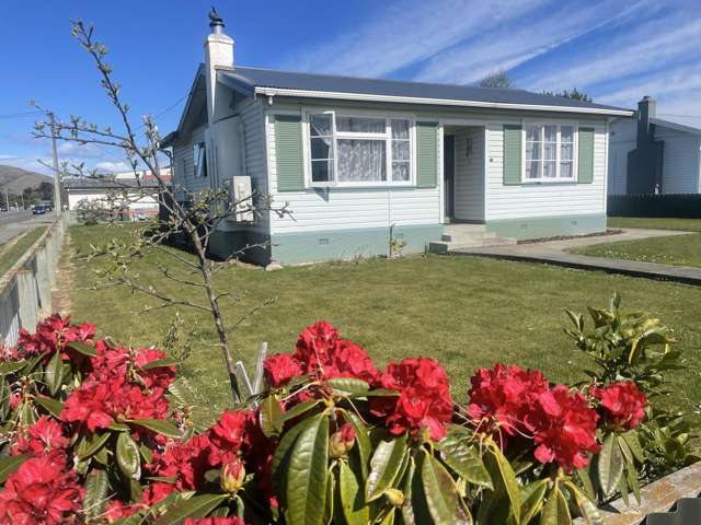
Start your property search
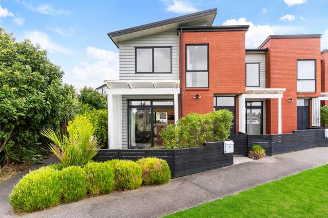
It can be a delicate balancing act creating a comfortable home that works well for yourself and your family, while not affecting your resale value down the line.
The good news is the two design outcomes don’t have to be mutually exclusive. It just requires some planning so you spend your budget in the right places.
The variables
Where you put your design focus will largely depend on how long you expect to be in your current home for.
If it’s your first home, you might be expecting to outgrow or upgrade your house within a year or two, or you might have deliberately bought a do-up with the goal of selling on for a profit. In these cases, your design focus should be more skewed to your potential buyers.
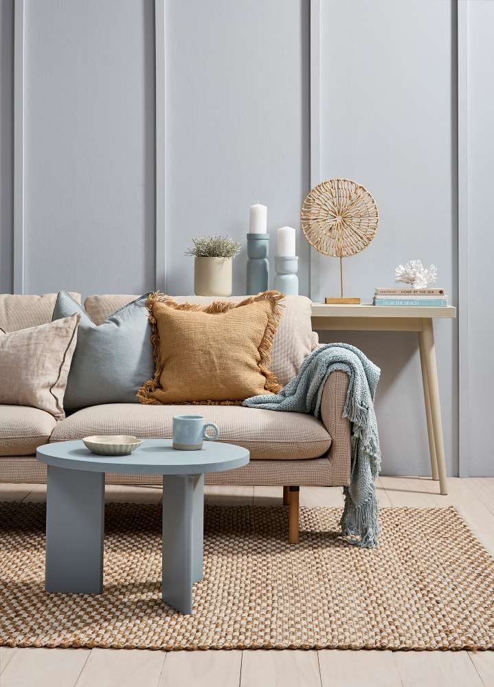
The subtle blue of the wall in this livingroom adds enough colour for personality without overwhelming the space. Wallsand battens painted in Duck Egg Blue, floor stain colour washed in Colorwood Breathe Easy, coffee table in Innocence, console tableand shell plate in Double Parchment, plant pot in TripleParchment, candlesticks in Half Innocence and Emerge and coral in Rice Cake. Couch from Nood, linen cushions from H&M Home, rug fromMocka. Project by Vanessa Nouwens, image by Bryce Carleton.
If you’ve bought a home you intend to live in for many years, your makeover is obviously going to be much more focussed on what you like and how you and your family live in it. It's OK - even important - to have aspects of a renovation that are important to you, simply to turn the house you have into the home you love.
With those things in mind, it’s also worth noting that spending wisely on bathroom and kitchen improvements will almost always resonate with buyers.
While there aren’t too many renovations that will lower the value of your property, it’s a good idea to get good advice from a local real estate agent before undertaking projects that reduce the number of bedrooms or bathrooms you have. A real estate agent who is a specialist in your local area should be able to tell you what buyers will look for in a home like yours; it may well be similar to what you want to achieve in the property for yourself - so it is always worth asking.
And remember, if you're considering selling, it's not just about doing a cost-effective renovation; it should also add something to your property, whether that is space, amenity or value.
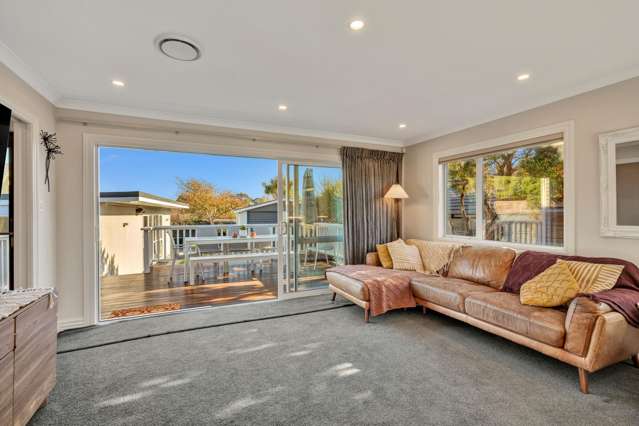
Good foundations
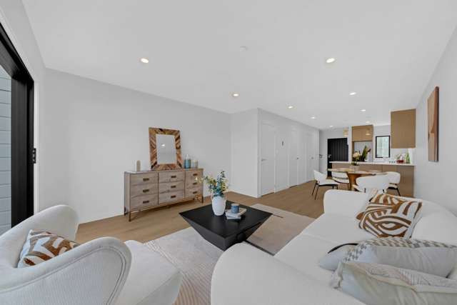
Whether you’re designing for yourself or for others, a backdrop in whites and neutrals can be your best friend. It allows you to create a versatile, adaptable canvas from which to build your own look, or spark the imagination of potential buyers.
Rather than a minimalist white-on-white approach to neutrals, Resene colour consultant Jackie Nicholls suggests exploring some of Resene’s more complex mid-tone neutrals.
White-on-white can, in some spaces, look a bit chilly and uninviting. You want colours that are a blank canvas but also feel inviting and spark some imagination in people.
Within the Whites and Neutrals range there are many mutable off-whites and creamy tones that look different in various light conditions or when placed next to other colours, appearing warmer or cooler, she says.
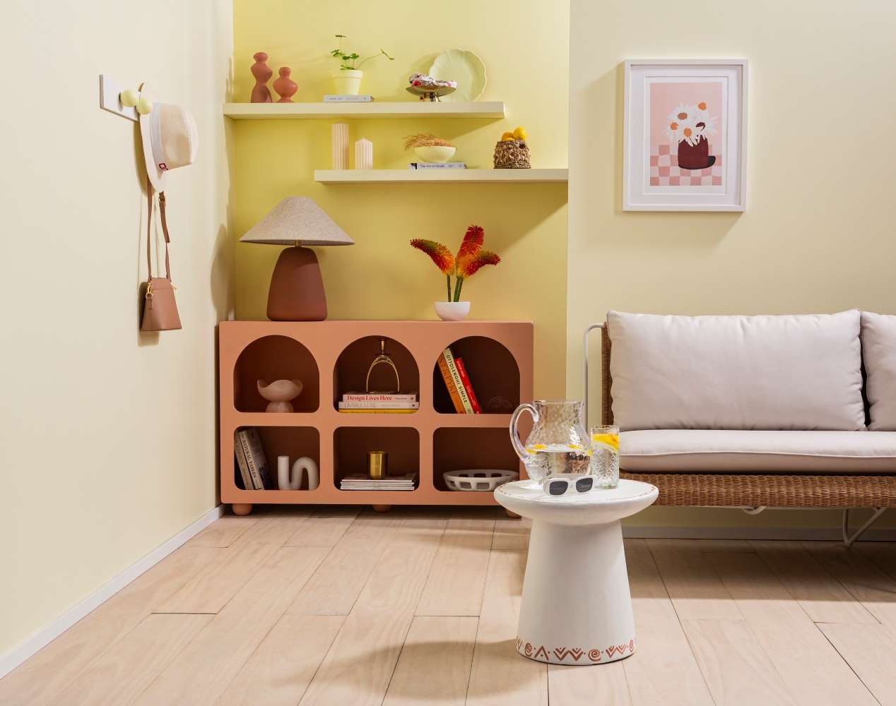
Adding bolder accents and colour blocks to a neutral room adds a touch of personalisation to suit your taste that can be easily changed by a new owner. Side and right walls painted in Pale Prim, nook wall and shelves in Cornfield, sideboard in Awaken, hook board in Alabaster and Pale Prim, floor stain colour washed in Colorwood Breathe Easy, skirting in Alabaster, coffee table in Double Alabaster and Summer Rose, top shelf candleholders in Summer Rose, plant pot and plate in Cornfield and bowls on shelf and sideboard in Double Alabaster. Lamp and chair from Soren Liv, artwork from Maiko Nagao, pillar candles and books from A+C Home, gold candle from Father Rabbit. Project by Melle van Sambeek, image by Bryce Carleton.
Some good examples are Half Tea, Spanish White, Fossil and Merino which are very versatile; just one of the reasons they regularly feature among Resene’s best-selling colours.
With that neutral base, you can build up the personalisation of your space to suit your taste, adding accent notes in your favourite colours and layering with throws, cushions and plants.
Try a dramatic contrast with a single chair or shelf painted in a bold shade like Moroccan Spice or Cab Sav, against walls in Half Tea, or layer in richer neutrals like Lemon Grass or Eternity for earthier contrast.
One place to play with brighter whites, like classic Black White and Alabaster, is in a kitchen where, with a good mix of natural and artificial light, they make the space feel functional, sophisticated and modern. Pair them with contrasting softer dark colours like Bokara Grey or Foundry for a clean, uncluttered and timeless look.
Other shades that can work well in bright white areas like kitchens are notes of a deep green like Midnight Moss, surrounded by pot plants for fresh herbs. Red is another popular colour in kitchens, so try contrast accents of wine shades like Red Berry or Vanquish.
This approach to working with a neutral base is also a useful tip for renters, allowing renters to personalise their homes without needing to change the landlord’s walls, Jackie says. Look for anything like picture frames, plant pots, blank art canvases, vases and pieces you can upcycle from second-hand shops to paint, stain or even wallpaper to add your own flair to your spaces.
A light touch of colour
If a key part of your renovation is giving your walls a refresh, you can work with subtle pastel and muted colours that will often give you a widely appealing, adaptable neutral look, with a little extra colour.
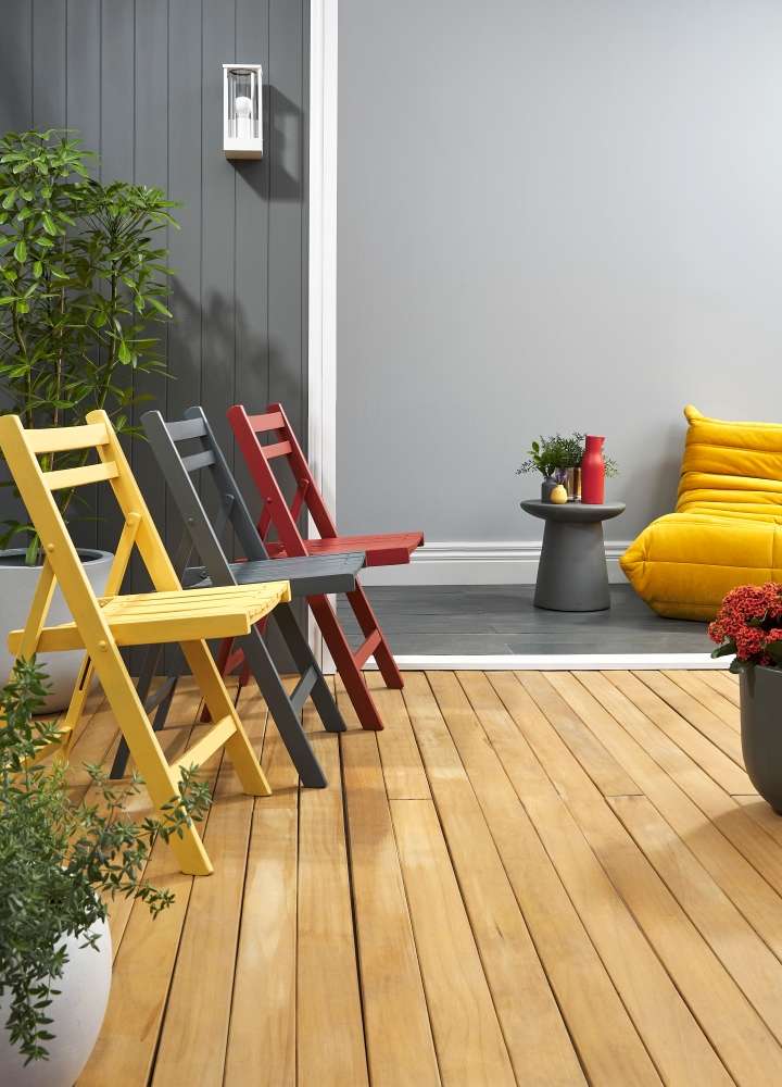
Bold pops of primary colour, whether it’s paint or stain can be used to create a connection between your interior and exterior entertaining areas. Deck stained in Woodsman Decking Oil Stain in Natural, exterior v-groove wall in Chicago, trim in Half Sea Fog, interior wall in Silver Chalice, skirting and outside light in Double Sea Fog, interior floor stained in Colorwood Shade, chairs painted or finished in (from left) Tulip Tree, Shade and Whero, rear planter in Silver Chalice, front planter in Double Sea Fog, right planter in Possessed, side table in Chicago, carafe in Red Red Red and small vases in Chicago and Tulip Tree. Chair from Derlook. Project by Moneuan Ryan, image by Bryce Carleton.
By choosing muted or soft shades, you get the benefit of colour, without it overpowering the room. Some subtle shades to try are grey-blues like Nebula or Half Spindle, soft pastel greens like Paris White or Coconut Cream, delicate peach tones like Cashmere or Dust Storm or pale yellows like Egg Sour or Splash.
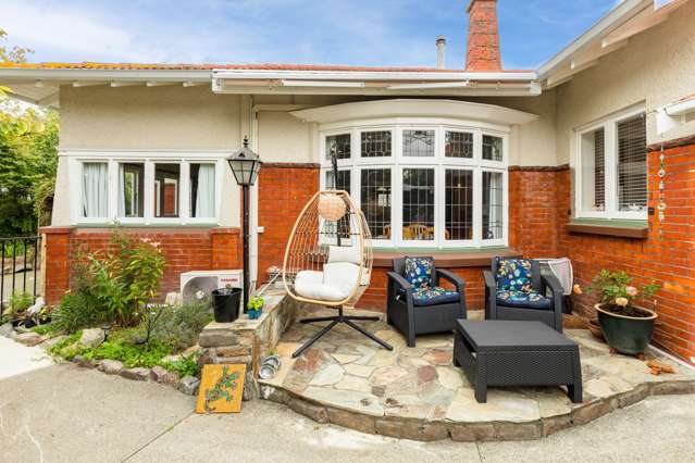
Tips for outdoors
One of the key things to do for your outdoor space to catch the eye of potential buyers is to make it look both intentional and adaptable. That means creating at least one space that feels sheltered and well-used for sitting or dining, ideally connected to your interior for that all important indoor-outdoor flow.
The bonus is that this improves the function of your outdoor areas for you and your family as well.
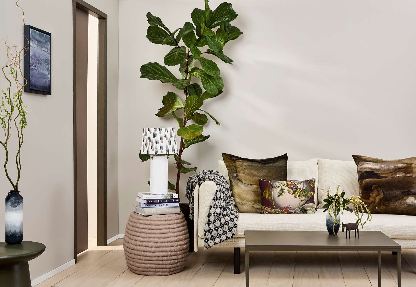
A neutral base that’s off-white or beige will give any room an interesting blank canvas from which you can add your personal touches. Walls painted in Quarter Perfect Taupe, skirting in White, floor stain colour washed in Colorwood Breathe Easy, door and rope side table in Otter, door frame and coffee table in Mondo, ombre vases in Eighth Rice Cake, Grey Chateau, Carpe Noctem, picture frame in Carpe Noctem, art in Seaweed, Plum and Waterloo, lamp base in Eighth Rice Cake, shade in Otter, Raven, and Mangrove and stool table in Mangrove. Sofa by Cameron Foggo for Natadora. Project by Katrina Hobbs, image by Bryce Carleton.
Take a similar approach to your indoor living area by using a combination of neutrals in wood stains like Colorwood Natural or Colorwood Driftwood and popular outdoor paint shades like Merino and White Pointer. Personalise that neutral base with vibrant planting and add some fun punches of colour on outdoor furniture and planters with bright bold sunshine shades like Meteor, Mai Tai and Hero. These shades work particularly well with dark fences painted in Element or stained in Waterborne Woodsman Pitched Black.
Top tip: A darker fence stain like Waterborne Woodsman Charred Black can make your outdoor area feel larger as black tends to recede from the eye so your property borders aren’t so firmly defined. This is particularly true when it’s used on fences behind trees and shrubs, as it starts to disappear into the shadows.
Remember you will never be able to choose colours that are universally liked by every potential buyer for your home, so choose the accent colours you love, and use them in a way that will catch the eye and inspire ideas in anyone viewing them.
Paint or stain is a good way to do this too, as it’s relatively simple and cost-effective for a new owner to re-do to suit their own taste.
If you need help finding the right colours to bring out the best in your home, come in and visit your local Resene ColorShop, Ask a Resene Colour Expert free online, www.resene.com/colourexpert or book a Resene Colour Consultation free instore or virtually or a paid home visit in selected areas, www.resene.com/colourconsult.