Red has been a popular part of the colour landscape in recent years, favoured for its ability to add show-stopping impact to any room.
But as the seasons change and our mood shifts, red is morphing from brick-red and bold toward burgundy, oxblood and brown tones, where the feel is cosier and earthier.
The evolution mirrors a broader mood change in design. After years of crisp whites, high contrast black accents and fleeting colour hits, interiors are softening. There’s a growing appetite for spaces that feel cocooning and emotionally resonant, and darker reds deliver that sense of comfort without slipping into nostalgia or heaviness.
Resene colour consultant Veronika Vuletic’s favoured deep reds are shades like Resene Persian Red, Rustic Red and Pohutukawa, which she likes for their versatility and ability to bring atmosphere to an interior.
Start your property search
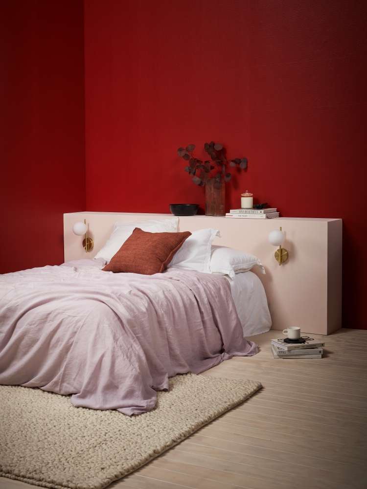
Acolour-drenched room in deep red creates a cocooning and cosy bedroom. Walls inResene Aroha, floor washed in Resene Colorwood Breathe Easy, headboard inInspire, bowl in Black. Lights from Kmart, bedding from Foxtrot Home, books andmug from Father Rabbit, cushion from Baya. Project:Amber Armitage. Image Photo / WendyFenwick.
“They bring warmth and depth, adding a cosy intimate vibe that works beautifully in living rooms, dining spaces or a snug study. These tones feel rich and grounded rather than bold or overpowering. Especially when paired with smart neutrals, pops of complementary colour, layers of lighting and textured finishes.”
As suggestions for those smart neutrals, Veronika suggests versatile mid-toned shades, such as taupes, smoky greens, and slate greys as starting points.
“Resene Half Drought works as a warm earthy neutral that softens red-browns like Red Oxide and adds lightness without breaking the mood. It creates balance and cohesion, allowing the reds to feel grounded rather than heavy.
“Lemon Grass introduces a muted green that gently lifts red-browns like Cab Sav by adding contrast without sacrificing colour. This complimentary colour keeps the palette feeling fresh.
“A slate grey like Streetwise provides depth and structure. Its charcoal base anchors the warmth of red-browns like Resene Digeridoo, adding definition and a contemporary edge while preventing the scheme from feeling flat.”
If you’re worried about darker reds making your rooms feel too oppressive, Veronika says there are simple ways to enjoy the opulence and richness of these shades without it overwhelming your room.
“Rich red-browns like Resene Persian Red, Resene Pohutukawa and Resene Rustic Red bring sophistication to interiors. You can absolutely use them throughout a space, but if you’re worried about it feeling heavy, consider limiting them to a feature wall, joinery or furniture,” she suggests. “Pair them with lighter neutrals for visual relief, and layer in complementary colours, textures and lighting to create a cosy, inviting atmosphere without overwhelming the room.”
Some unexpected combinations to try, that will let your reds sing, without dominating a space are:
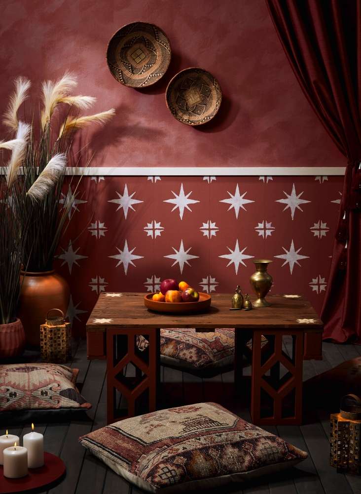
Lighter terracotta-toned reds keep the cosiness butbreathe air into a colour palette. Upper wall in Resene Apple Blossom andQuarter Solitaire mixed with Resene FX Paint Effects Medium, lower wall inApple Blossom with stars in Solitaire, table top in Resene Woodsman Bark, withstar features in Manhattan, breeze blocks in Manhattan, pots in Cinnamon andMocha, lanterns in Resene FX Faux Rust Effect, deck stained in Resene WoodsmanTiri, tray with candles in Burgundy, fruit tray in Cinnamon. Cushions from Yuva.Project: Melle van Sambeek. ImagePhoto / Bryce Carleton
- Burnt Crimson, Duck Egg Blue and Rice Cake: For a warm and inviting combination use Rice on walls, ceilings and trim, with Burnt Crimson as a feature wall or on headboards and cabinetry. Use Duck Egg Blue as accents on furniture, shelving or smaller decor and architectural details
- Sanguine Brown, Anise, Half Fossil: Go for earthy with an edge with Sanguine Brown (Resene Karen Walker Range) on walls, the fresh green of Anise on accent pieces, and Half Fossil on doors, ceiling, floor and trim.
- Red Oxide, Deep Teal, Alabaster: Layer the jewel tone of Red Oxide and Deep Teal for opulence and abundance. Alabaster on ceilings and trim will bring freshness. For a bolder look use your red or teal on the ceiling
Top tip on sheen: When making your brown-reds the main feature of a space, the finish really matters. Use satin or low-sheen like Resene SpaceCote low sheen on walls to enhance depth without too much glare, while semi-gloss Resene Lustacryl or gloss Resene Enamacryl on doors, cabinetry, or accents can make the colours pop, while also being easy to clean and maintain. This helps the warm tones feel lively and layered, giving rooms texture, personality, and a sense of sophistication.
General tips for decorating with brown-reds:
- As with any colour, getting the right undertone is key. Reds, even darker shades, can lean toward blue, brown, orange or pink undertones. Brick and oxblood reds feel grounded and sophisticated, while tomato or cherry reds are livelier. Getting the undertone right makes all the difference to how a red feels in your room, and what other colours it will pair well with. A Resene ColorShop expert can help you identify undertones.
- Deep oxblood, claret and brick reds like Resene Claret and Red Planet can behave more like warmed neutrals and can work well across larger surfaces such as walls, cabinetry or joinery without fearing they’ll overwhelm the space.
- Brown- reds shine alongside materials with substance. Think dark-stained timber like Resene Colorwood English Walnut, aged brass, bronze, stone and leather which amplify the colour’s richness and give it a timeless, grounded feel.
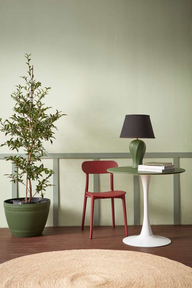
Even just asingle contrast note of a rich brown-red can elevate a space. Walls in ResenePale Leaf, wood panelling in Spanish Green, floor in Resene Colorwood Bark,pot, table top and lamp base in Palm Leaf. Project:Amber Armitage. Image Photo / WendyFenwick
- Some ice and blue greys can make browner reds feel muddy or flat. Instead, choose creamy whites like Half Solitaire, mushroom tones like Half Akaroa or warm charcoal like Dark Knight that reinforce the red’s warmth.
- Brown- reds deepen beautifully in low light and shadow. Embrace this by using them in spaces that naturally feel intimate where atmosphere matters more than brightness.
Sunbaked, rather than saturated
It’s worth noting, opting for a sophisticated red-brown colour palette doesn’t have to mean going for dark and moody. For lighter, sunbaked looks try brown-toned or burnt-orange-toned reds in softer and subtler shades.
Resene Merlot’s soft velvety notes make it less overpowering than some darker reds. Try it paired with a brighter shade like Jalapeno and cream Half Pearl Lusta. Layer orange red Luster with more muted Mexican Red and subtle dusky pink Dust Storm. Raisin red Fahrenheit offers an elegantly parched red that is softened by Resene Sakura pink, and creamy off-white Resene Bianca.